To show what ours does differently, someone had to design the ordinary one.
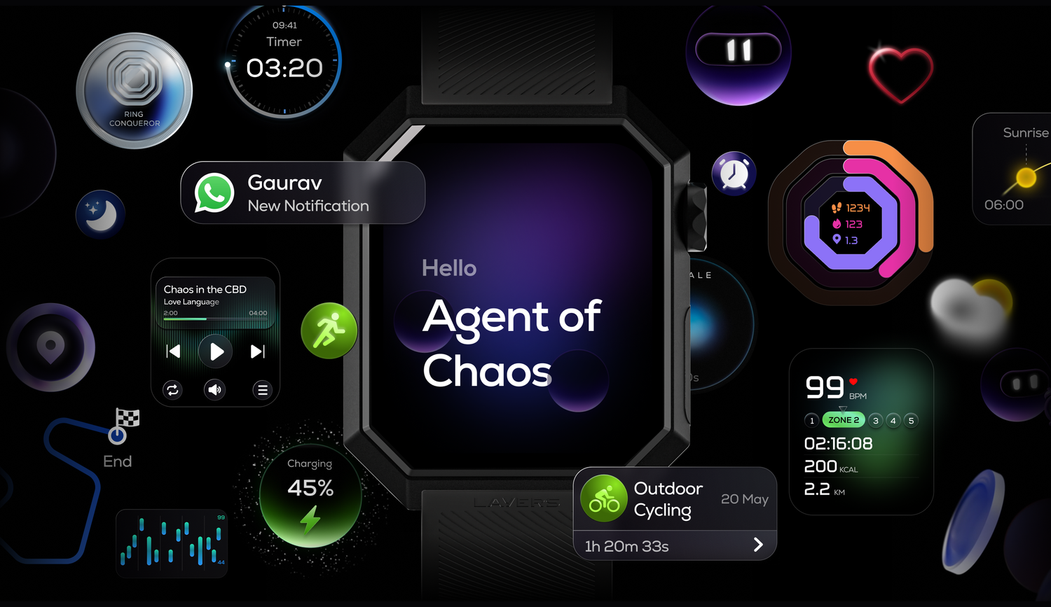
Built for a wrist. Sold on a phone.
Nexora runs on Anarc 2 — a screen you touch with one finger, scroll with a crown, and read in sunlight.
The website is something you scroll on a phone, in a browser, probably indoors. Every screen we put on the page had to survive that move — and a lot of what makes the OS feel alive is motion that a still image loses.
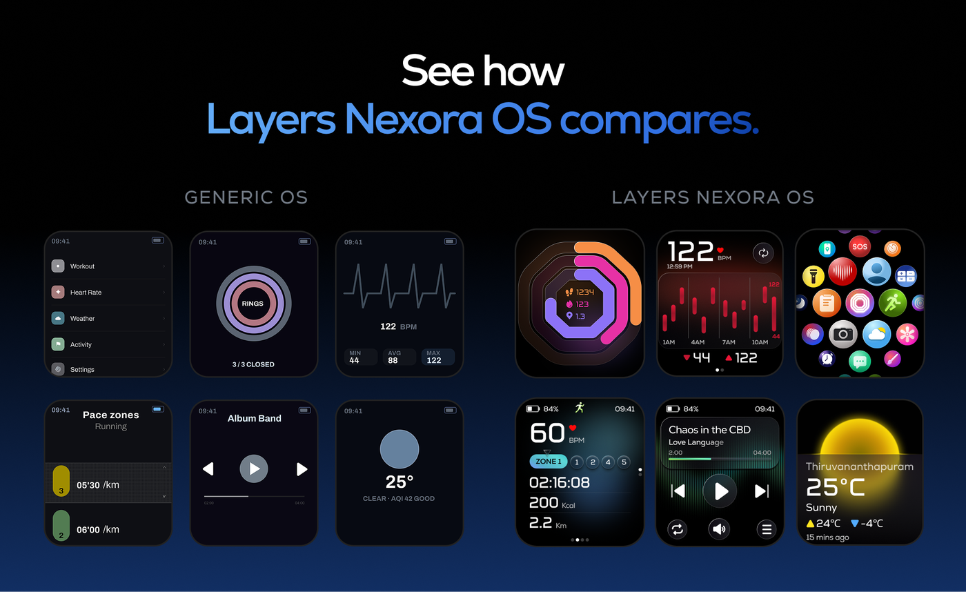
We couldn’t show a competitor’s interface. So the other side had to be invented.
Near the top of the OS page there’s a comparison: a generic smartwatch interface beside Nexora. Flat menu, static face, default type.
Putting a real competitor there wasn’t an option. Naming another brand and showing their OS next to ours reads as running them down, and that isn’t an argument you win.
So I generated it with AI — which turned out to be exactly the right tool for once. AI makes what it has seen most. Ask it for a smartwatch interface and you get the average of every smartwatch interface ever made. That is the definition of generic, and generic was the brief.
It still had to look plausible rather than bad. A comparison where the other side has obviously been sabotaged convinces nobody, and readers can feel it.
It’s the one module on the site where everything on screen is mine.
Everything in the hero is made twice.
The page opens with enough screens that the scale of what was new lands before you read a word. On a laptop that works.
At phone width, that many screens shrink to nothing. So the hero is a different image on mobile — one watch, with UI elements arranged around it. The same claim, made with one object instead of many.
It isn’t a reflow. It’s two separate compositions, and the page serves whichever one fits.
The video is cut twice as well. A vertical edit for the phone, and a wider, more dramatic one for the desktop — because a video letterboxed into the wrong shape is worse than no video.
Since the thing a still image loses is exactly the thing that makes the OS feel alive, the motion is doing the real work on either screen. Neither audience gets a lesser version of it — they get a different one, cut for the shape they’re holding.
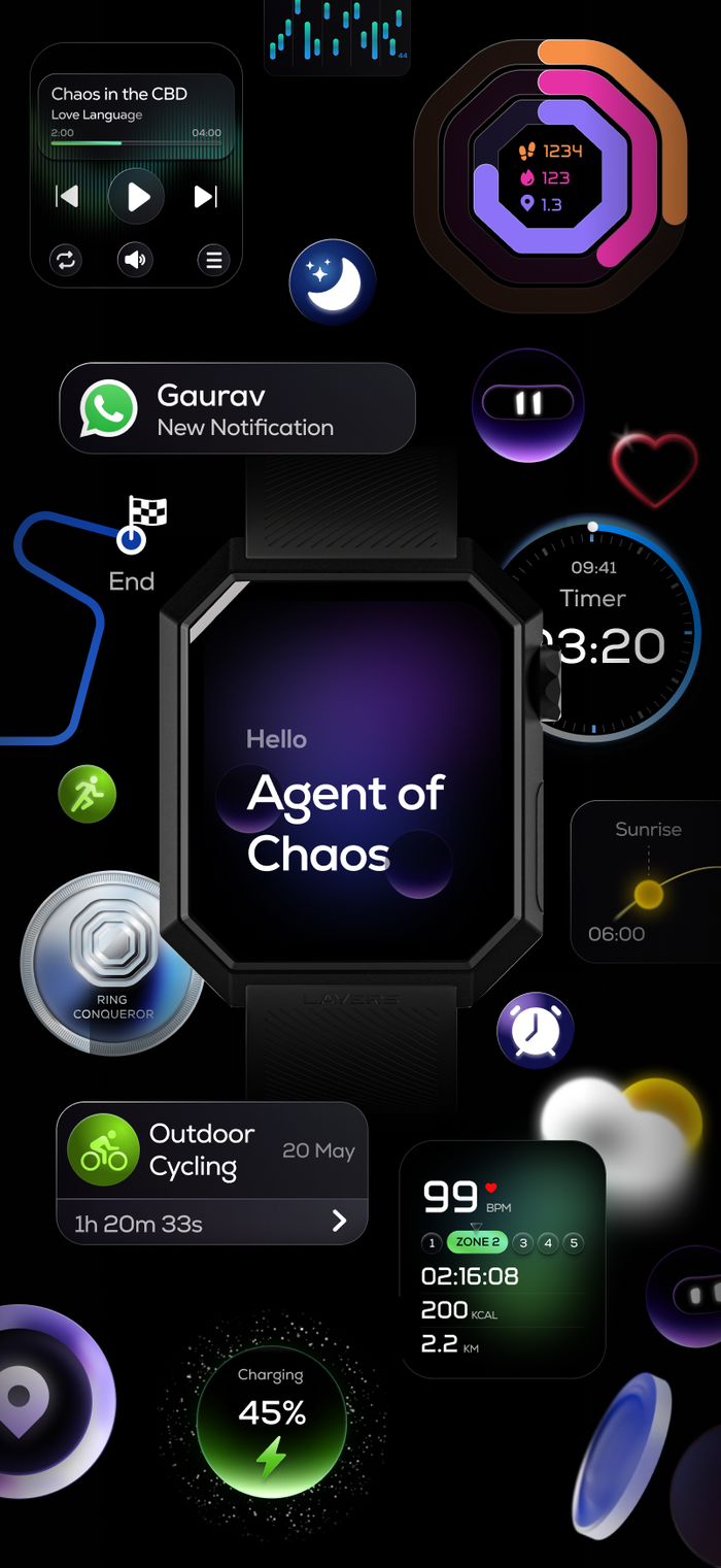
As a still, the desktop hero is more effective and I’d say so in the room — many screens at once reads as this is a whole system, one watch reads as this is a watch. The wider video is more dramatic too. The vertical cut narrows the gap more than the still swap does, but it doesn’t close it, and I haven’t found a composition at phone width that would.
Generated in-house, from our own watch.
The product renders across the site are generated in-house. Our 3D designer shot the watch from a defined set of angles, and those renders are the reference the generated imagery works from.
The watch in them is real, and so is the UI composited into it.
Two designers made this site — our senior UI designer and me. Marketing wrote the copy; we decided where it went and what it sat beside. Below is only what I can point at on the live page.
- The comparison module
- Concept and design, all 12 screens — the generic OS side, end to end
- Reviewed by our senior designer
- Layers AI
- The render
- Copy from marketing
- AI wallpapers
- Designed them
- —
- App section
- Designed it — I designed the app it is showing
- —
- Product page
- Renders and layout
- With our senior designer
- Everything else
- Placing supplied copy and imagery into layout
- Reviewed by our design manager
- Design lead
- Our senior UI designer led the site.
- Copy
- The Layers marketing team.
- Motion
- Our in-house motion designer.
- 3D & imagery
- Layers team, from our own 3D reference.
- Build
- An external agency.
- OS design partner
- Seymourpowell, London — credited on the page itself.
The hardest thing on the page was the interface nobody is supposed to want — and the only honest way to build it was with a tool that can only make averages.