Designing an operating system for a 1.85-inch screen.
Anarc 2 arrived as a style frame and a partial screen set. What it needed was an operating system. This is how it got one — about 460 screens designed against a memory budget, a battery ceiling, and a price that moved while we were building it.
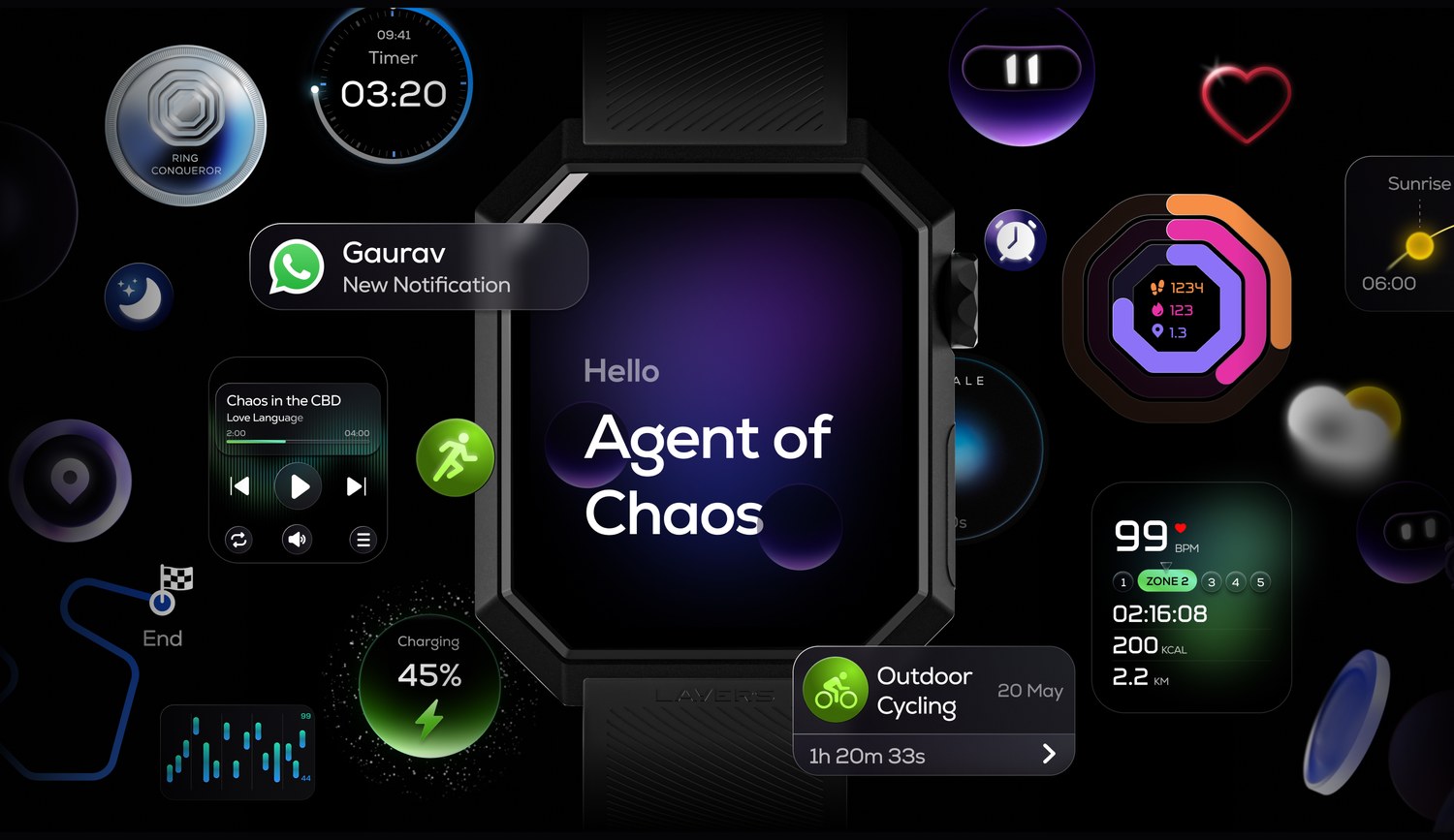
Roughly 460 of these. The watch, and the interface that runs on it.
The price moved while we were designing it. The constraints didn’t.
The plan was a watch around ₹5–6,000 — roughly a third under the Nothing Watch 3 Pro and the Moto Watch it gets compared to. Memory prices climbed through the year and every price in the category climbed with them. Anarc 2 launched at ₹6,999. Those two now sit at ₹7,999. The gap narrowed. It held.
But the interface was designed against the original number. A memory budget and a battery ceiling set for a cheaper watch don’t loosen when the bill of materials goes up — they get harder to hold. Almost every constraint below was decided before that price changed, and none of them were revisited afterwards.
Anarc 1 sold roughly 25,000 units over its life and has been out of stock for a long time, which is the pressure behind getting generation two out. Generation two keeps the silhouette people recognised and changes nearly everything else: a new operating system, GPS, better sensors, lighter on the wrist.
That last one wasn’t a design choice. Anarc 1 was stainless steel; Anarc 2 is aluminium, and the saving paid for the GPS module and the sensor upgrade. It made the watch lighter as a side effect. If the budget had allowed I’d have kept steel and spent more to hold the original thickness despite the GPS — but the money only goes one place, and we put it in GPS and sensors.
The category also moves quickly enough that more R&D time isn’t free. A better watch a year from now competes against next year’s watches. The date slipped more than once. The pressure never did.
An agency delivered the look. The operating system was built in-house.
Seymourpowell, in London, delivered a visual direction for Anarc 2: around 210 screens, roughly 35 flows, 24 icons and a basic set of global components — buttons, toggles, radios, playback controls. It gave us a clear starting point and a consistent look to argue with. A colleague helped with early exploration; the watch interface itself was mine to build out.
What shipped is around 460 screens and 50 flows, on a rebuilt component system. All 24 inherited icons were redrawn to the new visual language, four or five replaced entirely, and three new ones added for features that didn’t exist in the handover.
Two of those features are Layers AI and Canvas AI, which weren’t part of the original scope at all.
- Screens
- Flows
- Icons
- Animations
Handover → shipped
Four hundred people, after we thought we were finished.
The direction started earlier, and elsewhere. A survey inside our own community went to Seymourpowell in London, who built the style frame Anarc 2 began from. A style frame is a direction, not a system — it doesn’t know about a firmware memory budget, an always-on power ceiling, or what 460 screens do to each other once they have to live together. Most of it changed as it met those things. That is what a frame is for.
By the time the interface was close to final, I wanted it checked by people who weren’t us. I wrote a survey and put it out to 400 people across the country — Gujarat, Mumbai, Bangalore, Delhi. I screened the responses and called about a hundred of them myself. Eighteen of those came in for a session in person, under NDA: some at our office in Delhi, the rest on site in Vadodara.
Most of it came back confirmed. The clearest thing it changed was the icon set: I brought two versions into those rooms, and people rejected the one we had been leaning towards.
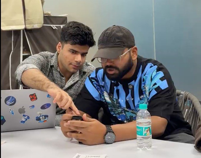
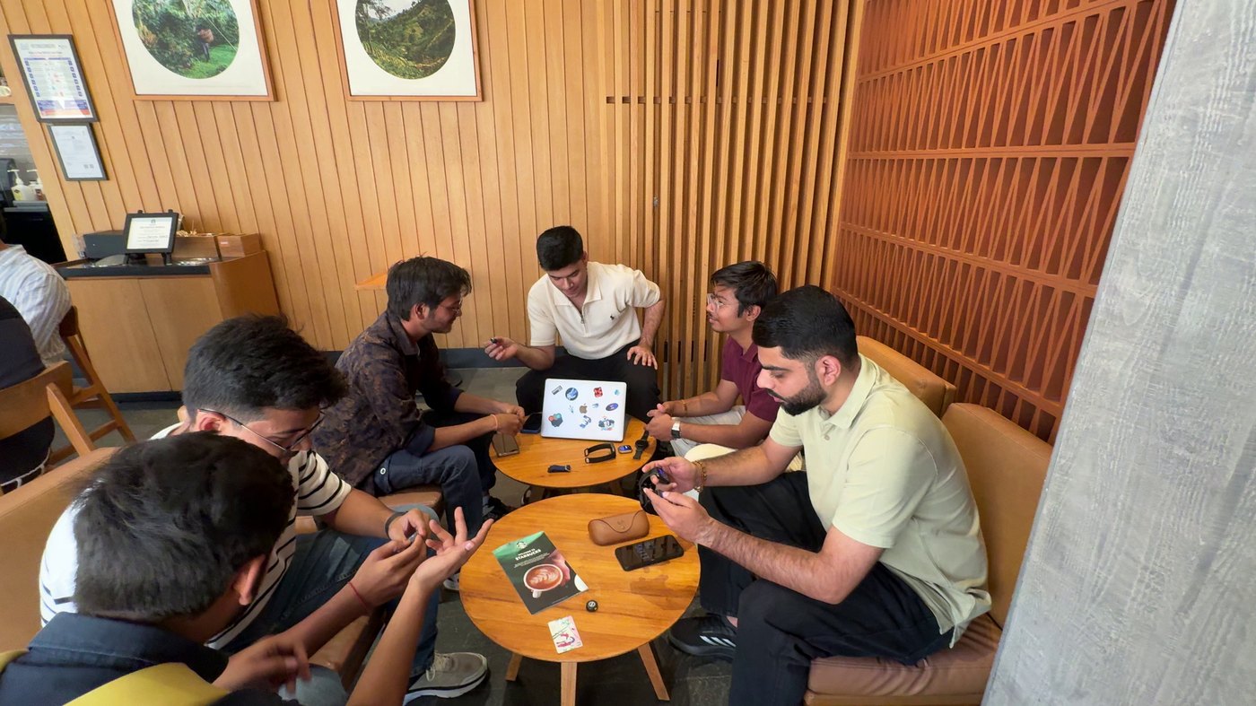
This was validation, not discovery — the design existed before the study did. Research this late can catch things; it can’t find them. It caught the icons. I’d still rather run it late than tell myself the reviews would do it for me.
With the always-on display, this watch runs two to three days. Without it, six to seven.
That gap is the single biggest number in the product, and it is decided almost entirely by interface. On AMOLED a black pixel is off and costs nothing. Every lit one is a withdrawal.
It’s also a bet. At this price, we decided a watch that lasts the week beats one with a richer interface you have to charge every other night. So that’s where the budget went.
The always-on twin
Every watchface needs a second version of itself. With more than 200 faces shipping, that couldn’t be an aesthetic decision made 200 times — it needed rules.
The rule outlived my own faces. Most of the 200+ shipping on Anarc 2 were drawn by other people, and every one of them derives its always-on twin from what I wrote down.
What survives: the time, and one accent. What goes: fills, gradients, background art, most colour. Roughly 70% of the pixels come off.
I set that ceiling by eye, against the battery target, not by measuring pixel draw. It held, but a measured budget would have been better than a designer’s judgement.
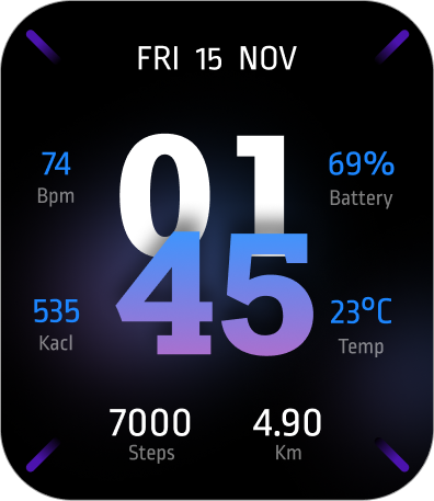
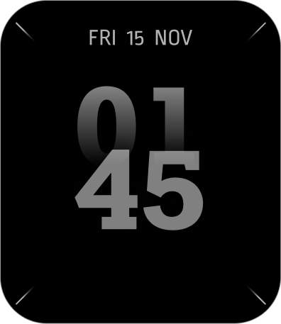
Hover the right one — it wakes, then falls back
Workout always-on
The workout screen is the most expensive screen on the watch, because it’s the one that stays on for an hour while you run.
So I gave it its own always-on state: heart rate, zone, time, and nothing else. Tap or raise your wrist and the full screen comes back. It’s a first in our price segment, and the reason a workout doesn’t cost you a day of battery.
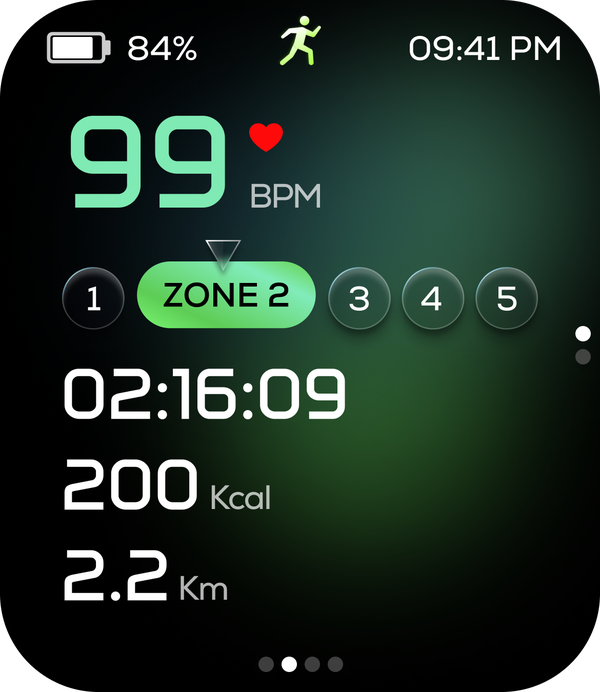
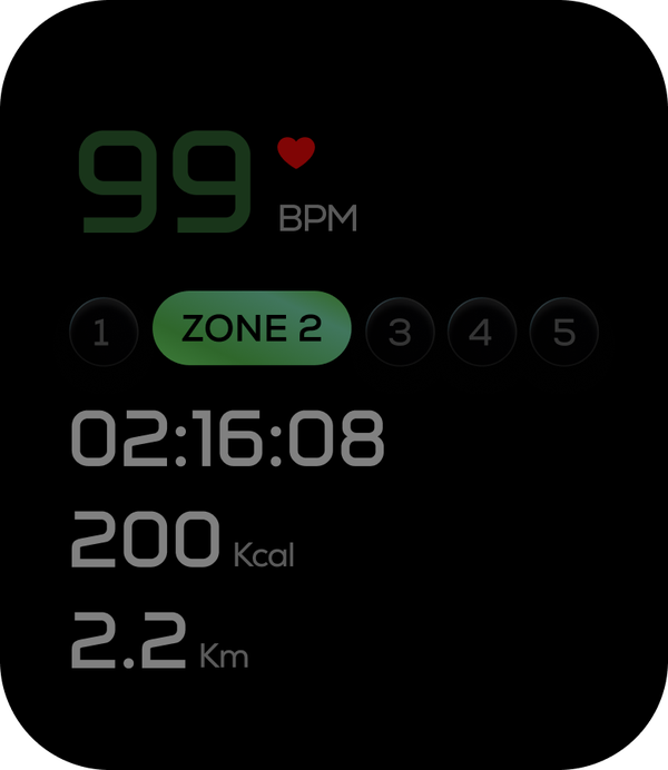
Hover the right one — it wakes, then falls back
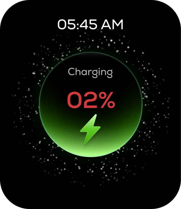
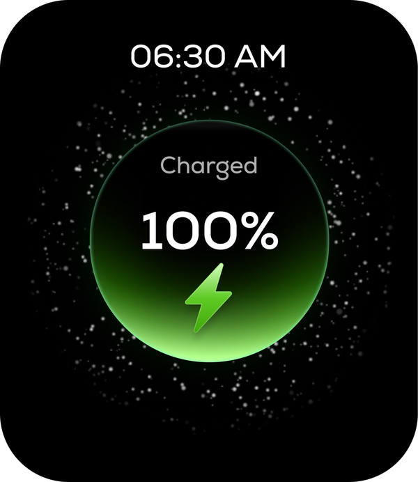
The charging screen that waits its turn
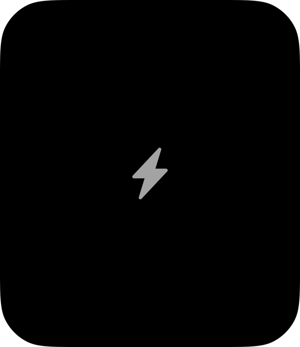
At 0%, plugged in, the watch shows a static bolt. The animation only begins once there’s enough power to run it.
A watch with no power left can’t afford to celebrate being plugged in. It just says it’s charging, and starts moving once it can.
Power saving
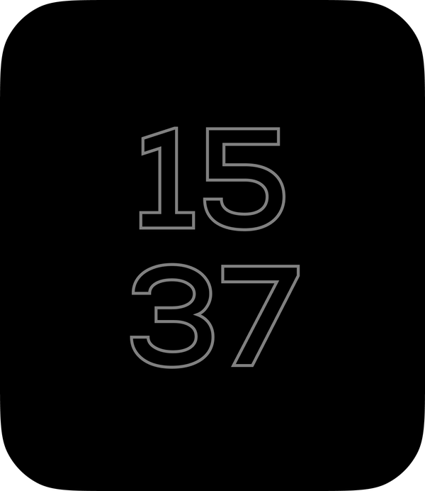
In power saving mode the time is drawn as outlines rather than filled numerals. Same information, a fraction of the lit pixels.
The activity badges take up more room than the heart rate monitor.
Every module on the watch has a storage cost, and they’re listed in a table our ODM partner keeps. Reading it tells you what this product is actually for.
The four activity badges — the screens that appear when you close a goal — come to about 33 MB. That’s twice the entire weather app with its twenty animated conditions, and more than heart rate, blood oxygen and stress put together.
A company that thought it was selling a health tracker would never spend its storage that way. We did, because that’s the part people talk about.
Watchfaces run from 240 KB to 17 MB depending on how much they move. One elaborate face can cost more than the entire weather app.
What we did about it: we kept the badges and capped them. They’re the part of the product people show each other, so cutting them to save storage would have been saving the wrong thing. What shipped is the most compressed version that still looked like a celebration — the floor, not a compromise we settled for.
Weather, twice
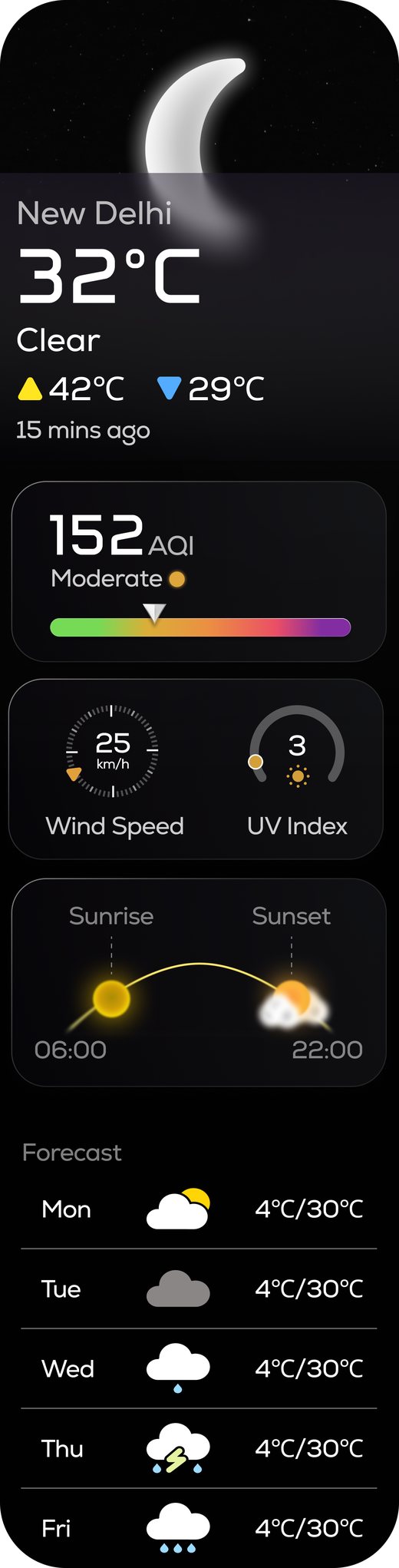
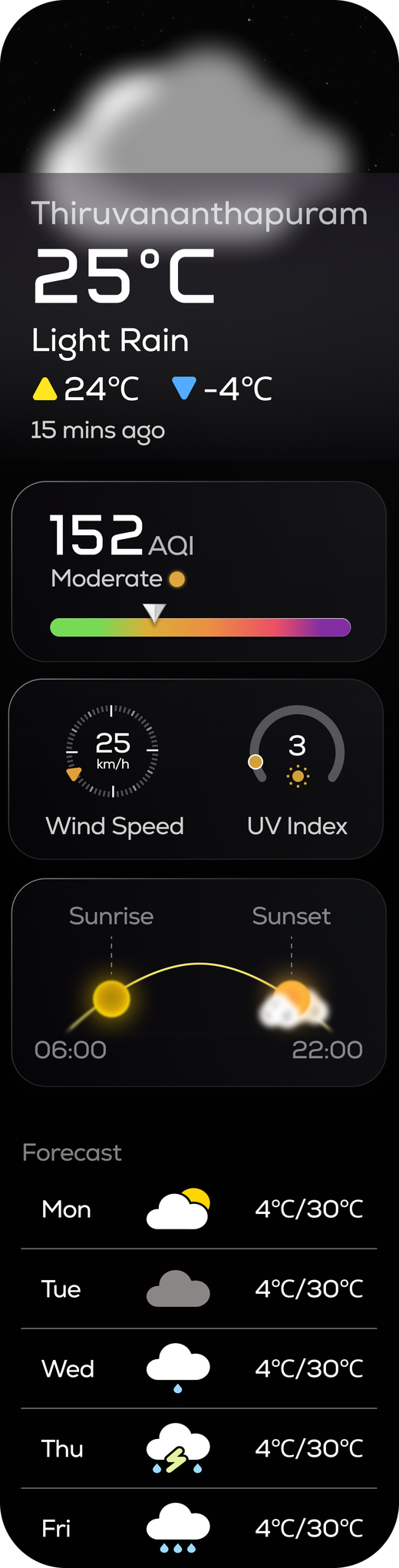
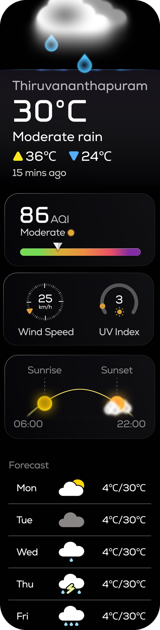
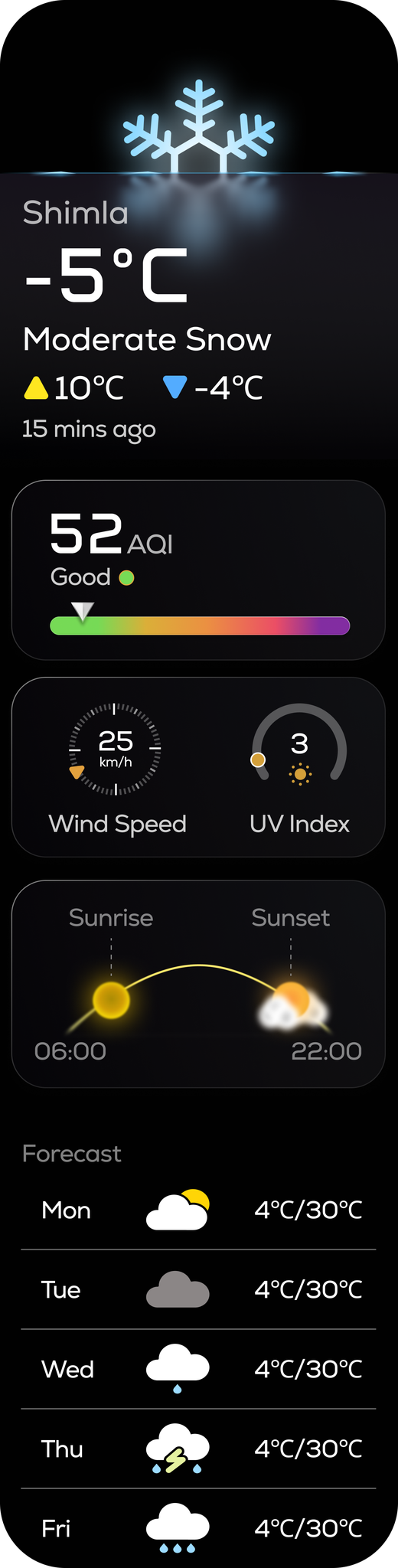
Twenty weather conditions ship on Anarc 2 — from overcast and heavy rain through to sandstorm, smog, typhoon and haze. In the weather app, every one of them is animated by our motion designer.
On the side screens, the same twenty are static. The side-screen framework wouldn’t carry animation, so the same data gets a different treatment depending on where you meet it. That’s not a compromise I’d hide — it’s how you spend a budget.
Ceilings, designed
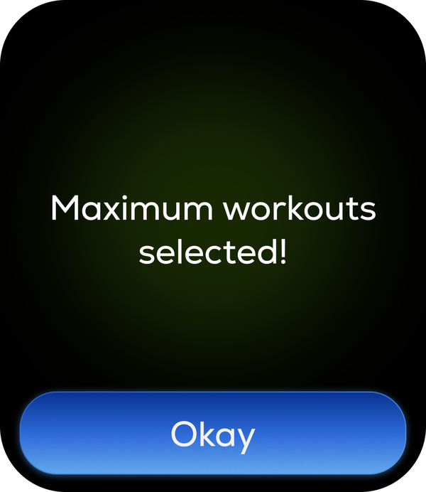
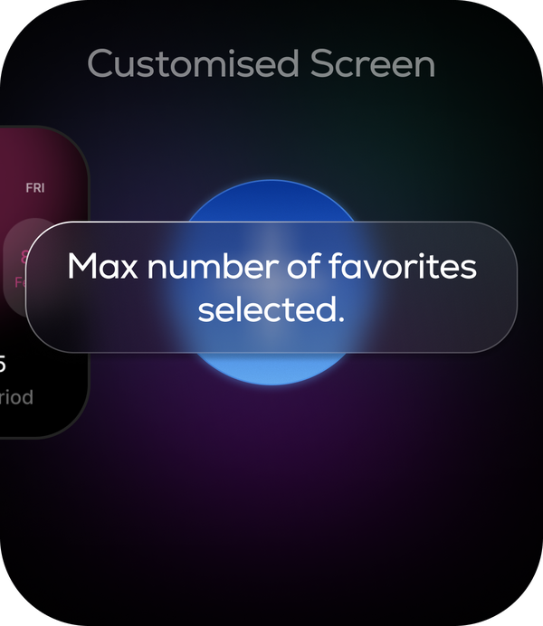
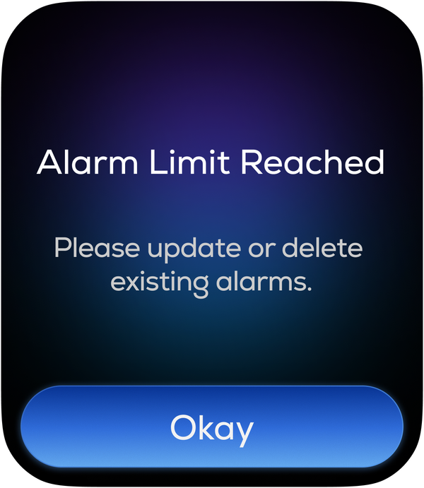
You can add workouts to your list, favourites to your side screens, complications to a watchface, alarms to your day. Each of those has a limit behind it, and every limit has a screen.
Hitting one of those limits shouldn’t feel like an error. The shelf is full, and that’s all the screen needs to say.
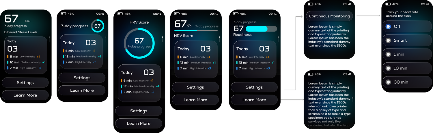
We designed heart rate variability. We didn’t ship it.
The screens existed. The feature was cut because the sensor couldn’t measure it reliably at the price this watch sells for, and a health number you can’t trust is worse than no number at all.
I argued to keep it. The founder and product head cut it. They were right, and it’s the decision I’d defend hardest to someone outside the company.
The same principle, everywhere else
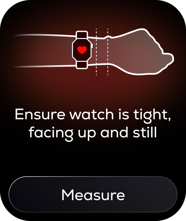
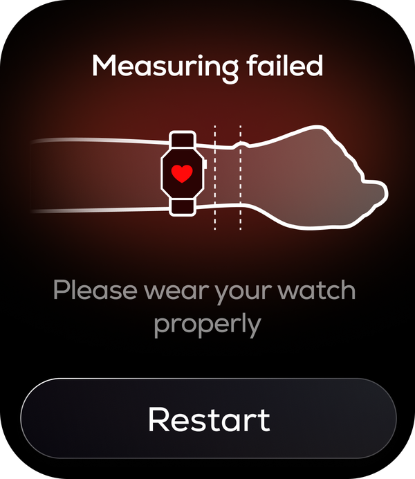
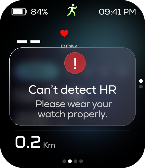
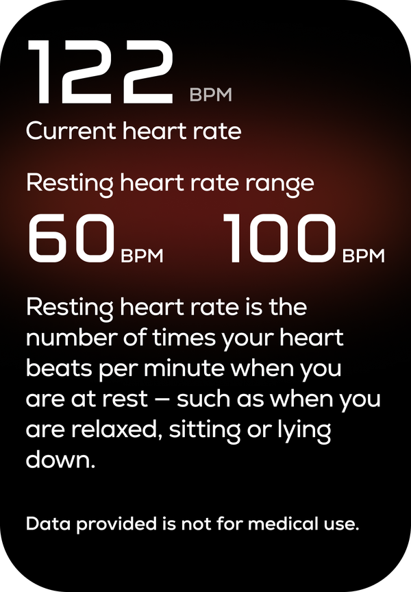
That thinking runs through every measurement screen on the watch:
- Before Ensure watch is tight, facing up and still
- On failure Measuring failed — please wear your watch properly
- Mid-workout Can’t detect HR
- Every detail screen Data provided is not for medical use
The countdown we removed
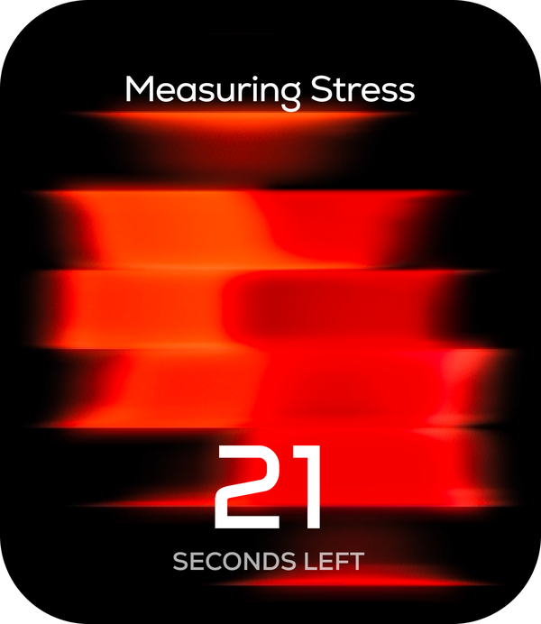
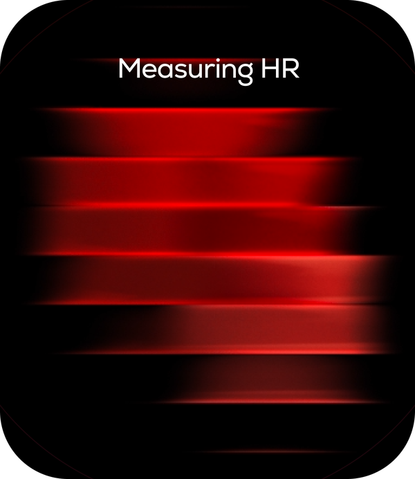
The handover design showed a countdown during measurement — seconds remaining. I took it out, because a reading can finish early, and a timer that lies about how long something takes is worse than no timer.
The animation runs until there’s a result. Then it stops.
Nexora — the name comes from next, as in the next hour.
This is where most of the time went. The handover gave us a direction; turning it into something that reads on a 1.85-inch AMOLED screen in Indian daylight took months.
Icons
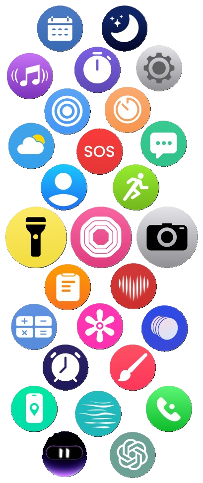
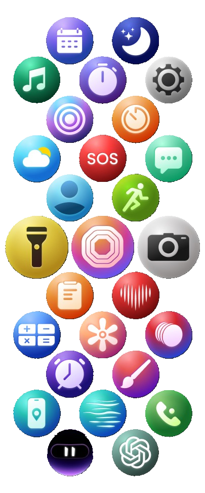
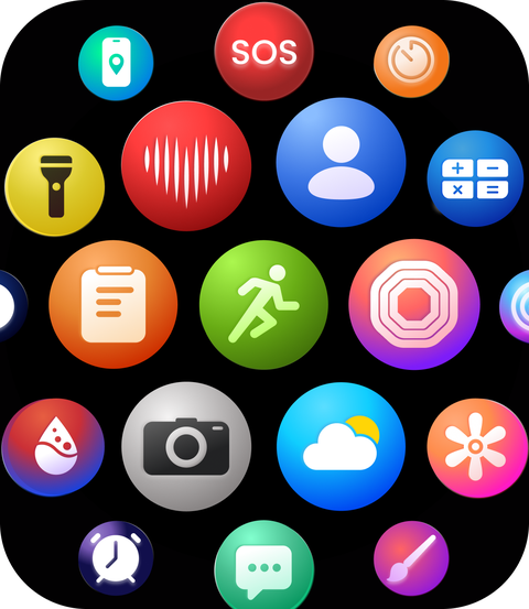
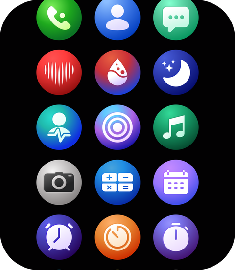
All 24 inherited icons were rebuilt. Rather than argue the style internally, I drew both: one flat set with minimal gradient, one with more contrast and depth.
Both went into the research sessions, and close to everyone picked the gradient set. It is also the right answer for the panel: depth on a darker base reads better in sunlight than flat colour does.
Neither of these is the shipped set. They were references, drawn to settle a direction rather than to ship — the icons on the watch came out of Option B and kept moving after the sessions ended.
Preference in a room is not behaviour in a shop. What it did settle was an argument that would otherwise have gone to whoever spoke loudest.
Four or five were redrawn completely, three were new. One isn’t new at all: the raise-to-wake icon shipping on Anarc 2 is the one I drew as an intern for Anarc 1.
Components
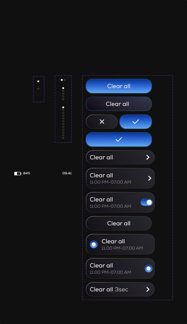
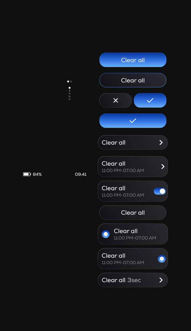
The handover’s global set covered buttons, toggles, radios, checkmarks, playback controls and page indicators. I rebuilt all of it and extended it into a full system.
Pressed states were defined once and handed to the developers, so every button in the product responds the same way. That’s roughly the most useful hour of work in the whole project.
Shadows
The handover system leaned on shadows for depth. None of them shipped. On AMOLED a shadow is lit pixels spent on decoration, and in sunlight it costs contrast rather than adding it.
Themes
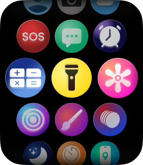
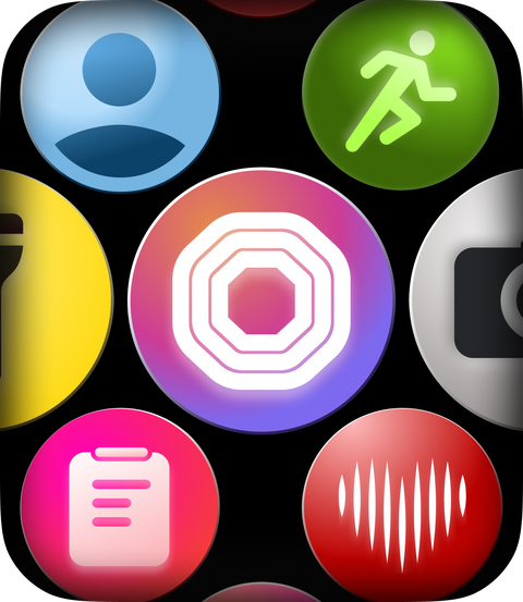
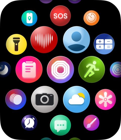
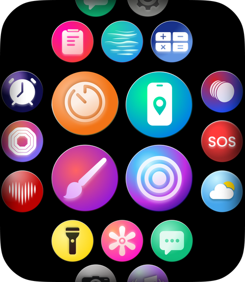
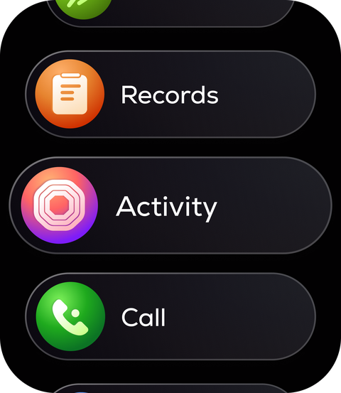
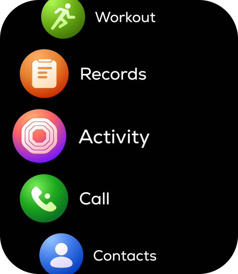
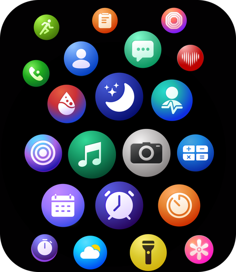
The handover offered four menu arrangements. We ship five: Card List, List, Waterfall, Grid and Inline. These aren’t skins — they’re different ways of moving through the same set of apps, because how you like to navigate a watch turns out to be personal.
What the research changed
The study didn’t reset the direction. It calibrated it. The original visual language was brighter and heavier on shadow than what shipped; talking to people who would actually wear this watch brought it down.
My first reaction to the handover icons was that I didn’t like them. I had no reason beyond taste, and within a few weeks I’d come around. We changed them anyway — but because people told us the visual language was too loud, not because of anything I felt in week one. It taught me to hold instinct loosely and wait for evidence.
Tap and hold looked right in Figma. On an arm it wasn’t.
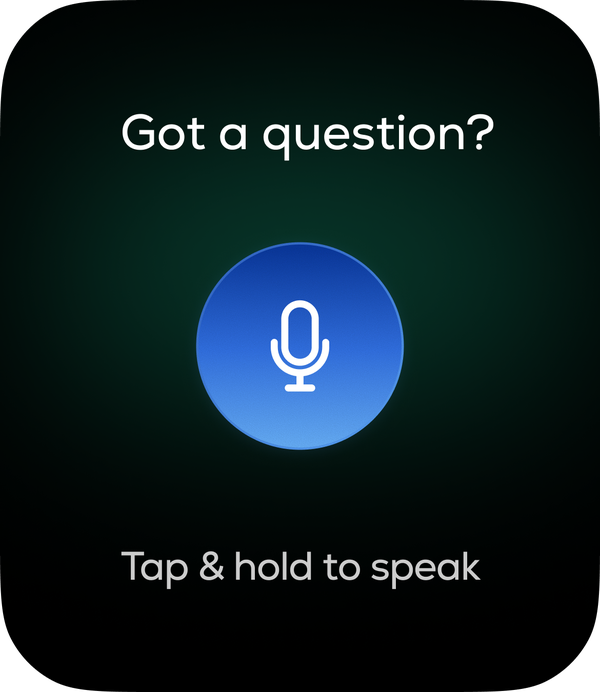
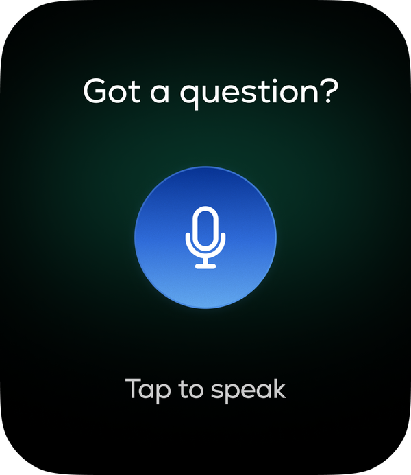
To ask Layers AI a question, you originally held your finger on the screen while speaking. It tests perfectly on a laptop. On a wrist, with your arm raised and a long question to ask, it’s uncomfortable — and it gets worse the longer you talk.
I only caught it on an internal build. It’s now tap to start, tap again to stop.
I’d had a hunch it would be awkward, but no way to demonstrate it — the problem doesn’t exist on a screen, only on a body. On-wrist testing moved earlier for the features that followed.
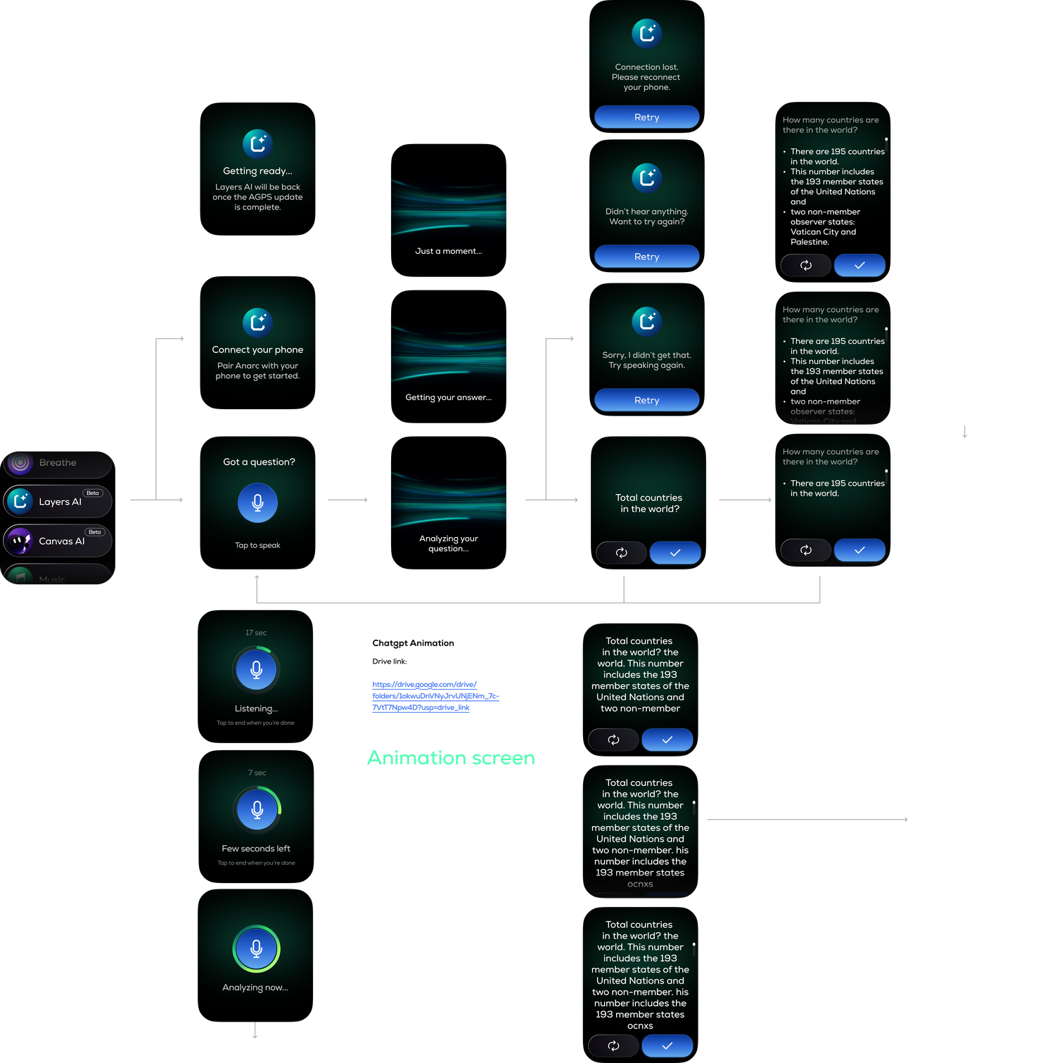
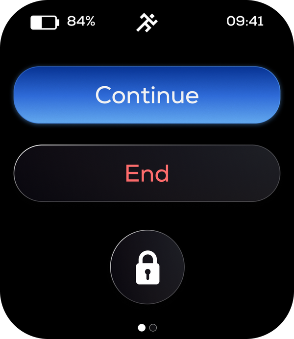
Four actions where there were two
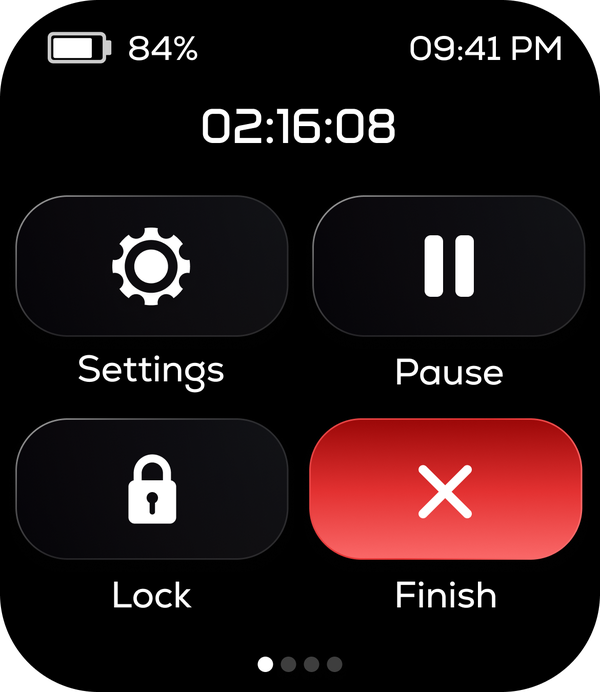
The handover’s workout controls offered Continue and End. Mine offer Settings, Pause, Lock and Finish, in a 2×2 grid on the same screen.
Twice the actions in the same space, on a screen you’re looking at while moving. Finish is red and asks for confirmation, because it now sits next to Pause and a wet thumb mid-run shouldn’t be able to end your session.
A guide that gets out of the way
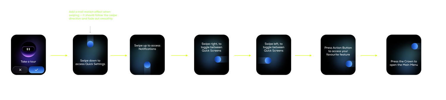
Every workout opens with a two to three second visual: swipe right to pause, swipe left for music. Then it disappears and the workout starts.
People buy this watch the way they buy sneakers.
Layers is a lifestyle brand. The health tracking is real and we take it seriously, but the reason someone picks this watch over another one in the same price bracket is how it feels to live with.
- Canvas AI Makes a watchface from your voice. Say “a cute puppy with polka dots” and it generates, installs and applies it, on the watch.
- Mylo Delivers the reminders — drink some water, time to sleep, let’s move around — as a character with a face rather than an icon and a line of text.
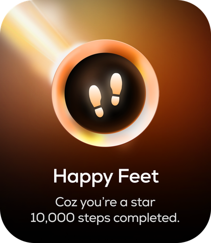
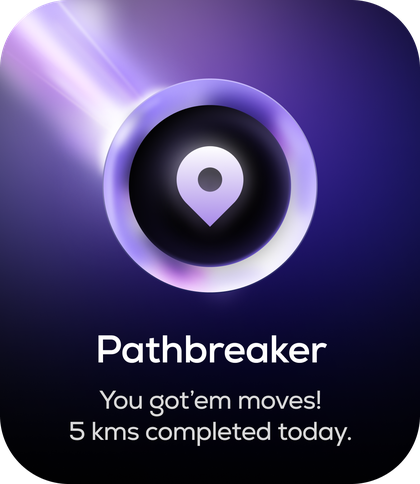
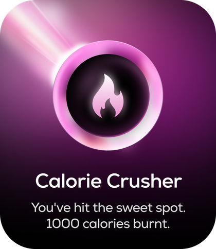
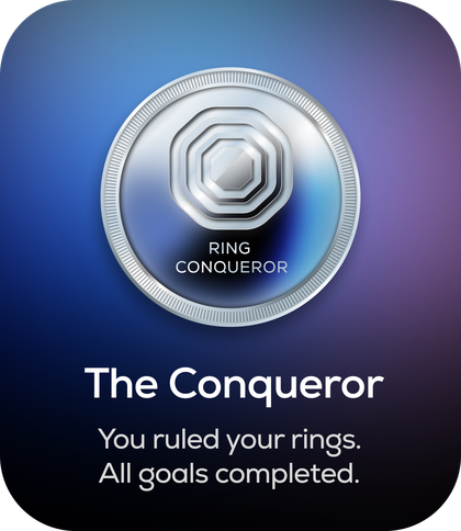
- Badges They have names. Happy Feet for steps. Pathbreaker for distance. Calorie Crusher. The Conqueror when you close everything.
- Flashlight Four colours, because sometimes you want the red one.
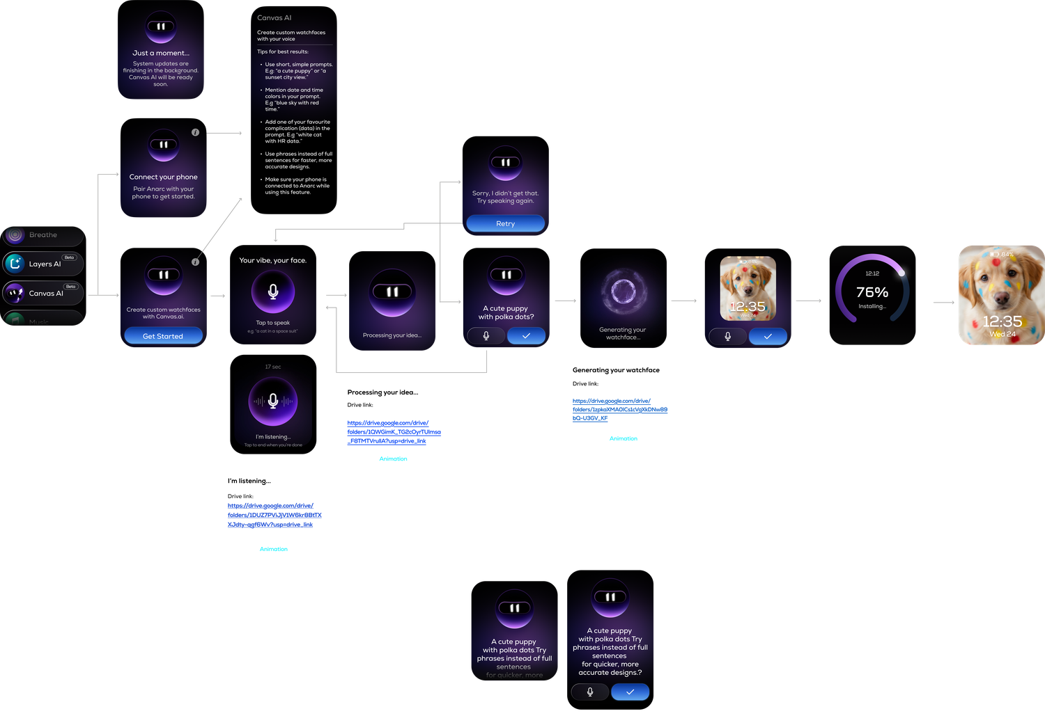
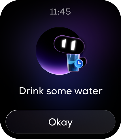
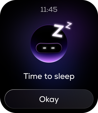
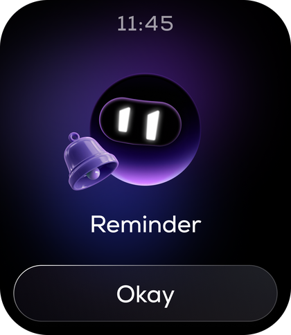
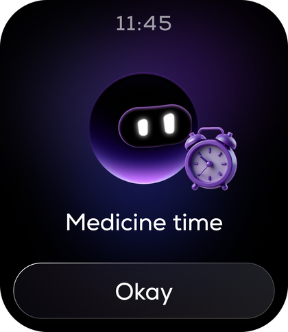
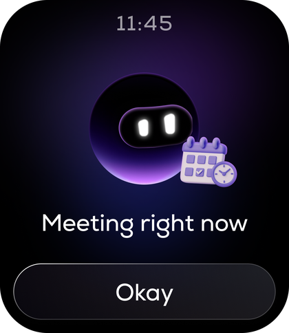
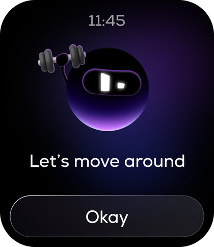
Mylo — the six alert cards
Some problems don’t survive being solved over messages.
The samples that didn’t match. On the last trip, the production samples came back with visible grain the earlier ones didn’t have. I flew out with the original samples, put them side by side, and had the vendor show me what surface finish they could actually hold at volume.
The new sample was close enough to the original that I approved it. If it hadn’t been, that was the trip to find out — not after a hundred thousand units.
The gap in the battery readout. Watchfaces draw the battery percentage from a three-character slot plus a percent sign. At 100% it looks right. At 10% you get a number, a hole where the third digit would be, and then a stranded %. On the second trip we found it, and fixed it in the room: iOS and Android don’t print the percent sign at all — they put the number inside the battery capsule. We did the same, and the battery icon went into the watchface tool. Faces that were already finished got redrawn around it. Over messages that is three days and a translation problem. Standing next to the developer it was an afternoon.
- Nov 2025with our assistant product manager
- Built a 250-point defect list and worked through it on site. Learned OpenHarmony’s watchface tool — not to build faces, but to find out what the rendering engine could actually do before committing to designing them.
- May 2026with our product head
- Closed the UI firmware. Reviewing screens over messages across a language gap was slow, so we finished it in the room. After this trip, only sensor and firmware work continued.
- Jul 2026alone
- Colour and strap sample sign-off, plus app work.
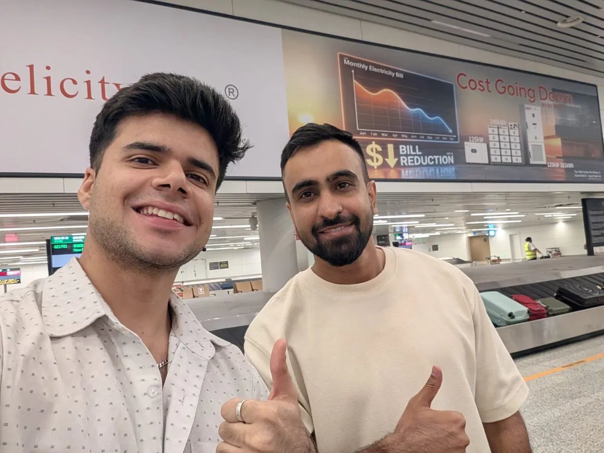
Guangzhou, May 2026 — with our product head, the trip we closed the UI firmware
I’ve worn a Samsung Galaxy Watch 6 on one wrist and Anarc 2 on the other for six months.
Every day, workout and sleep data from both went back to the team. Sensor tuning improved against that comparison. UI defects went onto a running list and shipped as fixes in the next firmware update.
Other people on the team wore it too. Later, tech reviewers got units. The feedback so far has been positive for this price segment.
This is continuous testing by people who built the thing, plus reviewers. The first-time reactions came earlier, in the research sessions — by the time we were wearing it every day, none of us could see it fresh any more.
The bet held on my wrist. I want to know if it holds on everyone’s.
There’s no launch data yet, so here is what I’d actually go looking for — and what I already believe, from wearing it.
- Battery It holds. I once went about fifteen days without charging it. The number I’d want is how many people leave always-on switched on — that’s the real test of the trade we made.
- Sensors Sleep and workout data are good for the price. They are not Whoop or an Apple Ultra, and I wouldn’t claim otherwise. I’d want our numbers compared against a reference device across a real user base, not just my two wrists.
- Watchfaces More than 200, plus custom faces from the app. Nearly every watch has that now — so the question isn’t whether it exists, it’s how often people actually change theirs, and whether support stops being asked where the new ones are.
- Workout always-on The thing I’m proudest of, and the easiest to verify: how many workouts run with the screen on, and whether battery complaints show up in reviews.
- The AI features Honestly, I don’t use them. They’re the features you show someone in a shop, or to a kid who asks what the watch does. I’d want to know whether that’s true of everyone or just me — because if it is, that budget belongs somewhere else next time.
A watch interface is never one person’s file.
Most of what shaped this product came from arguing with people who knew something I didn’t — what the panel could render, what the ODM could hold, what the firmware would allow.
- Seymourpowell, London
- Delivered the visual direction and ~210 screens. I inherited it, argued with it, and rebuilt what didn’t survive the real screen.
- Firmware team
- Told me what the panel and the rendering engine could actually do. Pressed states were specced once, for everyone.
- App developers
- The phone side had to agree with the wrist. Shared components, shared language.
- ODM partner
- Kept the storage table that decided what shipped. Three trips, one alone.
- Design manager & product head
- Reviewed everything. Overruled me on HRV, and were right.
Anarc 2 shipped on 21 September 2026. Post-launch numbers aren’t in yet, so everything above is still scope, constraint and reasoning rather than outcomes — but it is now on wrists that don’t belong to us.
Given more budget I’d have kept steel, held the thickness, and pushed for auto workout detection and better sensors. We got a long way inside the price, and there’s still room to do better — the category just doesn’t wait while you find it.
The interface file is locked. I have a short list of small things I’d still change, and I probably won’t be there to ship them.
I wore an Anarc on one wrist and a Samsung on the other for six months. It didn’t change a screen — it changed what I know to aim for. Workouts that reorder themselves around what you actually do, a sleep score you understand before you finish reading it: none of that is visual, all of it is somebody’s team spending years on the boring half of the problem. I can see the gap. Most of it isn’t taste, it’s budget and sensors and time. That is the work I want next.
A phone app can be fixed on a Tuesday. This one goes out on a hundred thousand wrists and stays the way I left it. I’ve never designed anything that made me check my work so many times.