The tool decides what a watchface can be.
Anarc 2 ships with 200+ in total
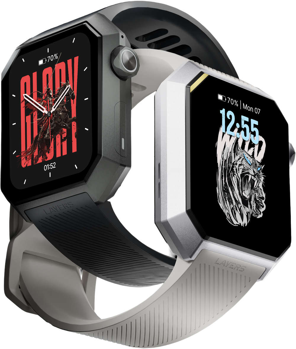
The two most-downloaded faces of 2025 — Glory and Wild — are mine
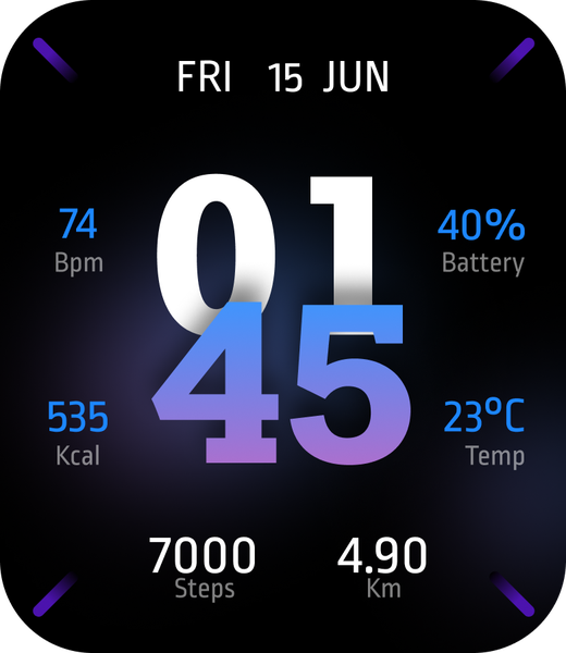
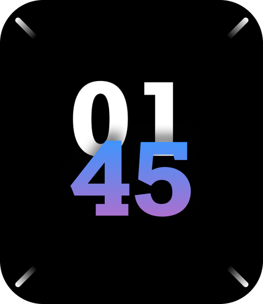
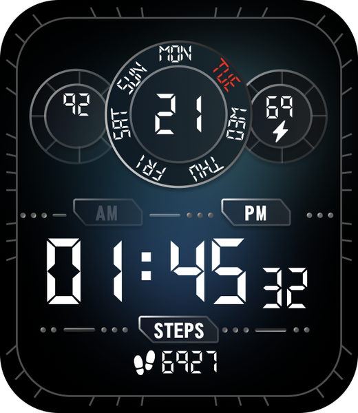
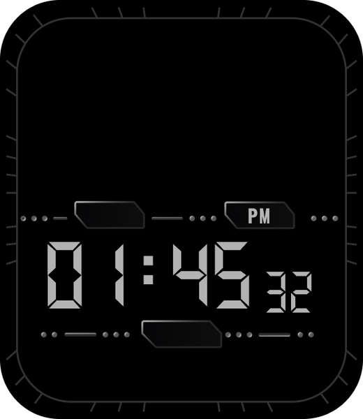
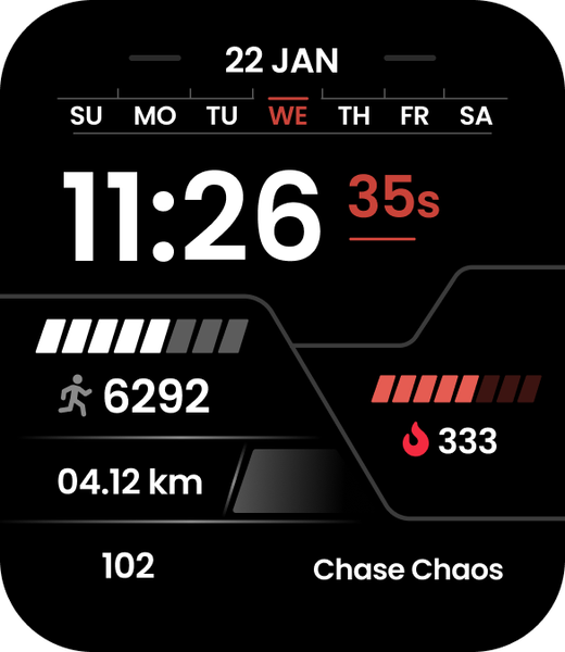
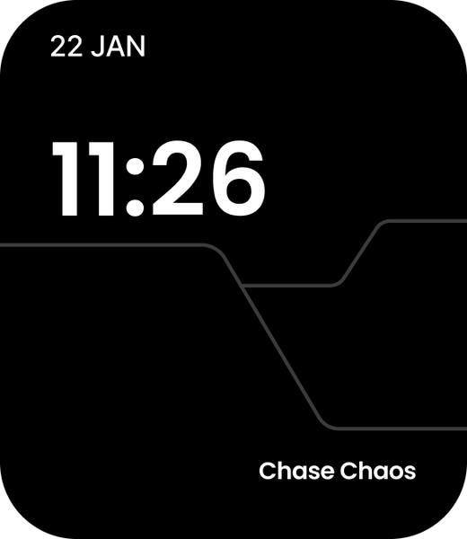
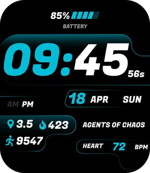
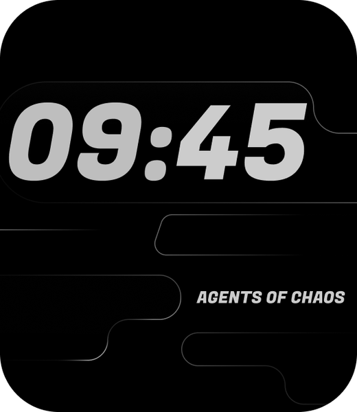
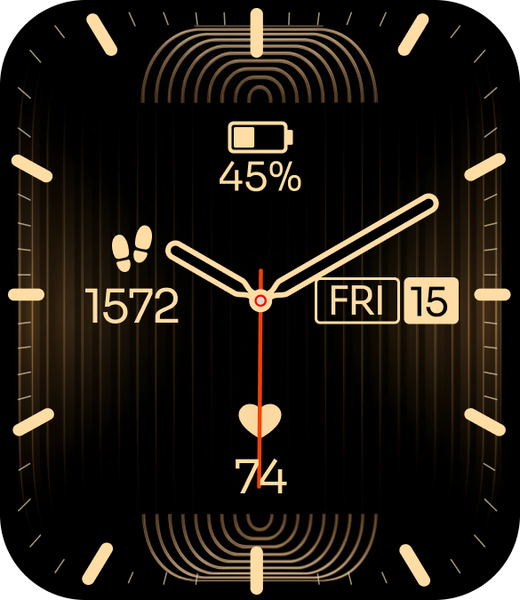
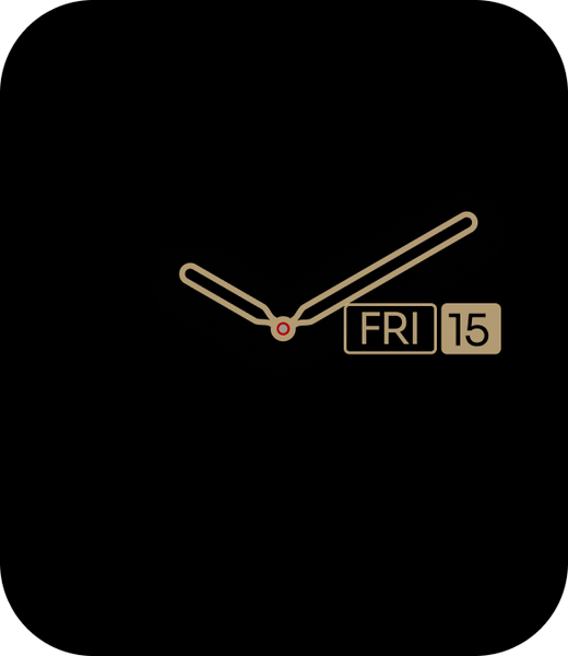
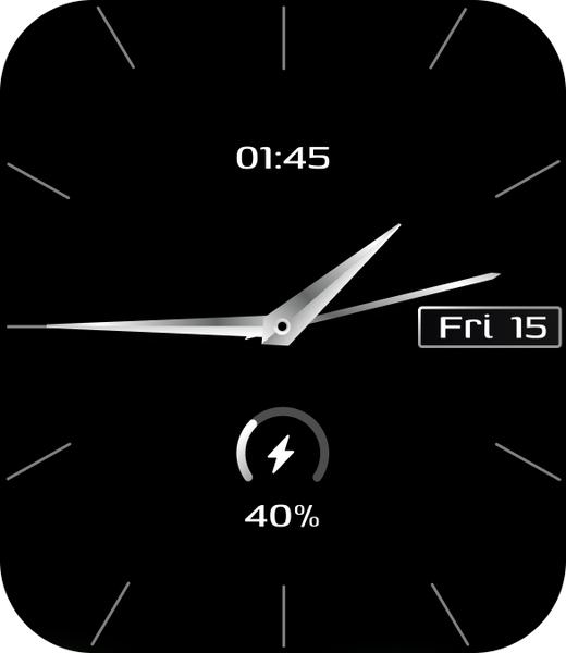
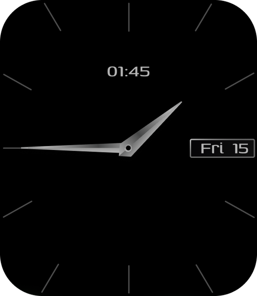
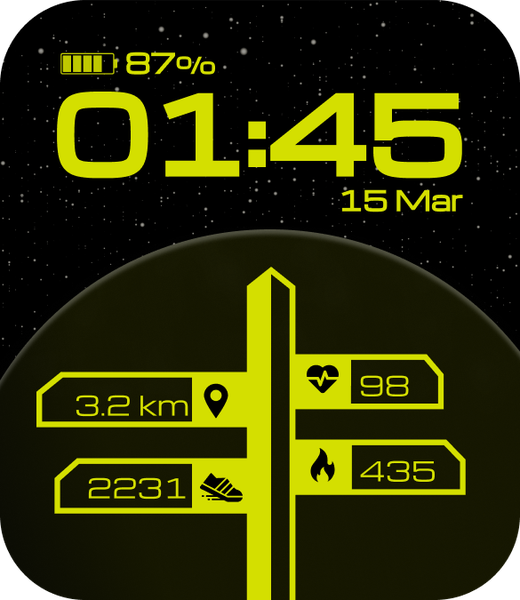
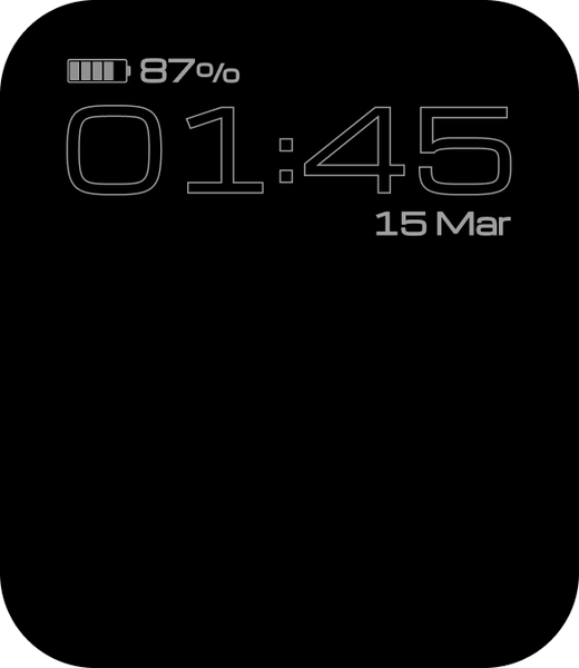
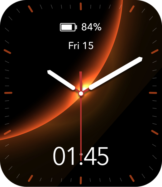
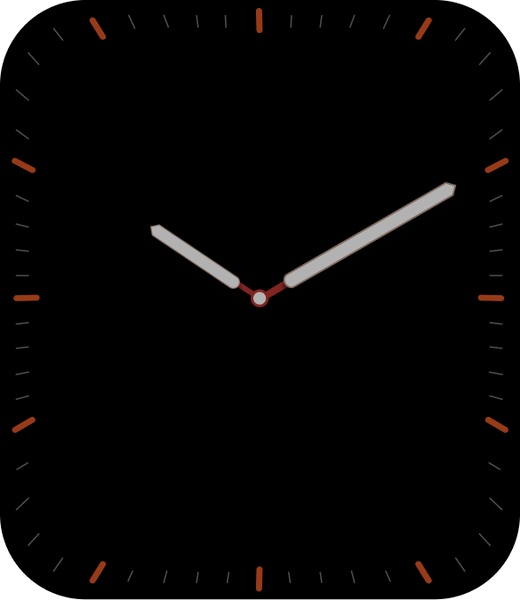
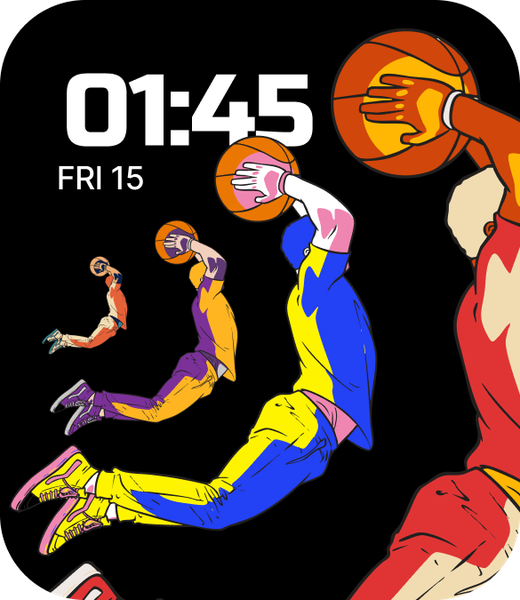
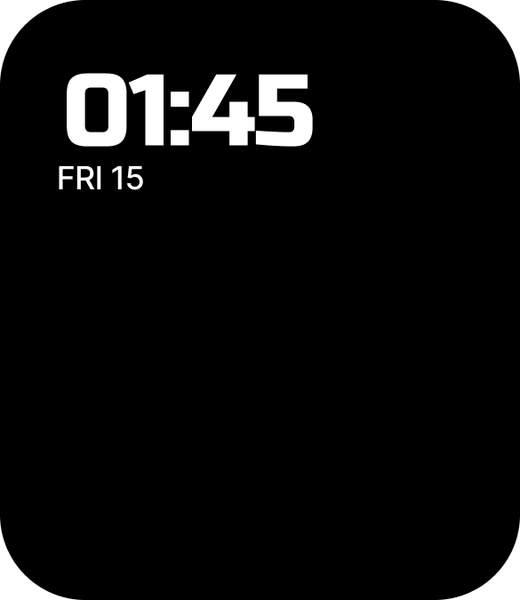
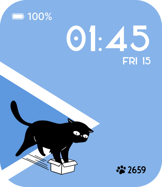
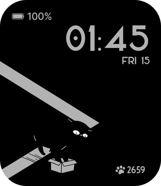
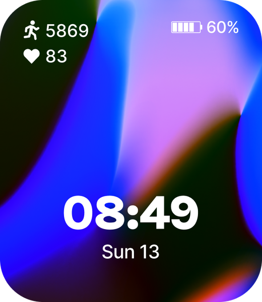
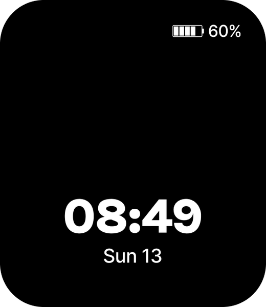
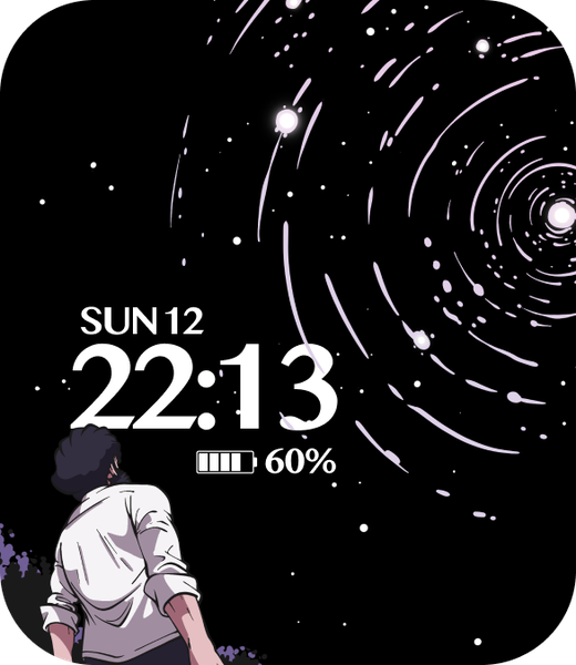
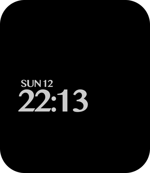
Hover any face to see its always-on twin
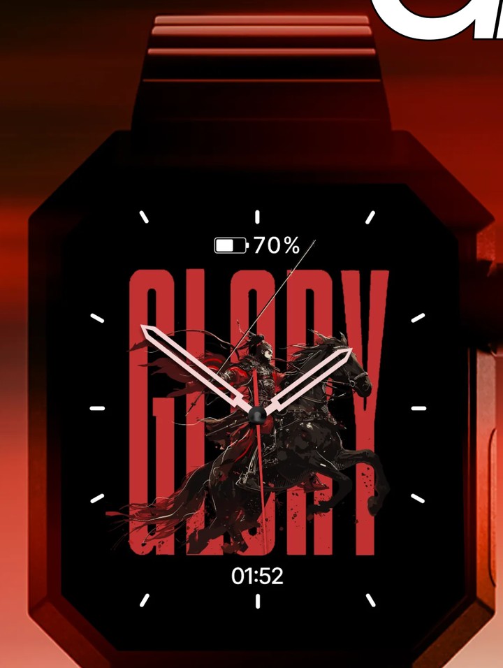
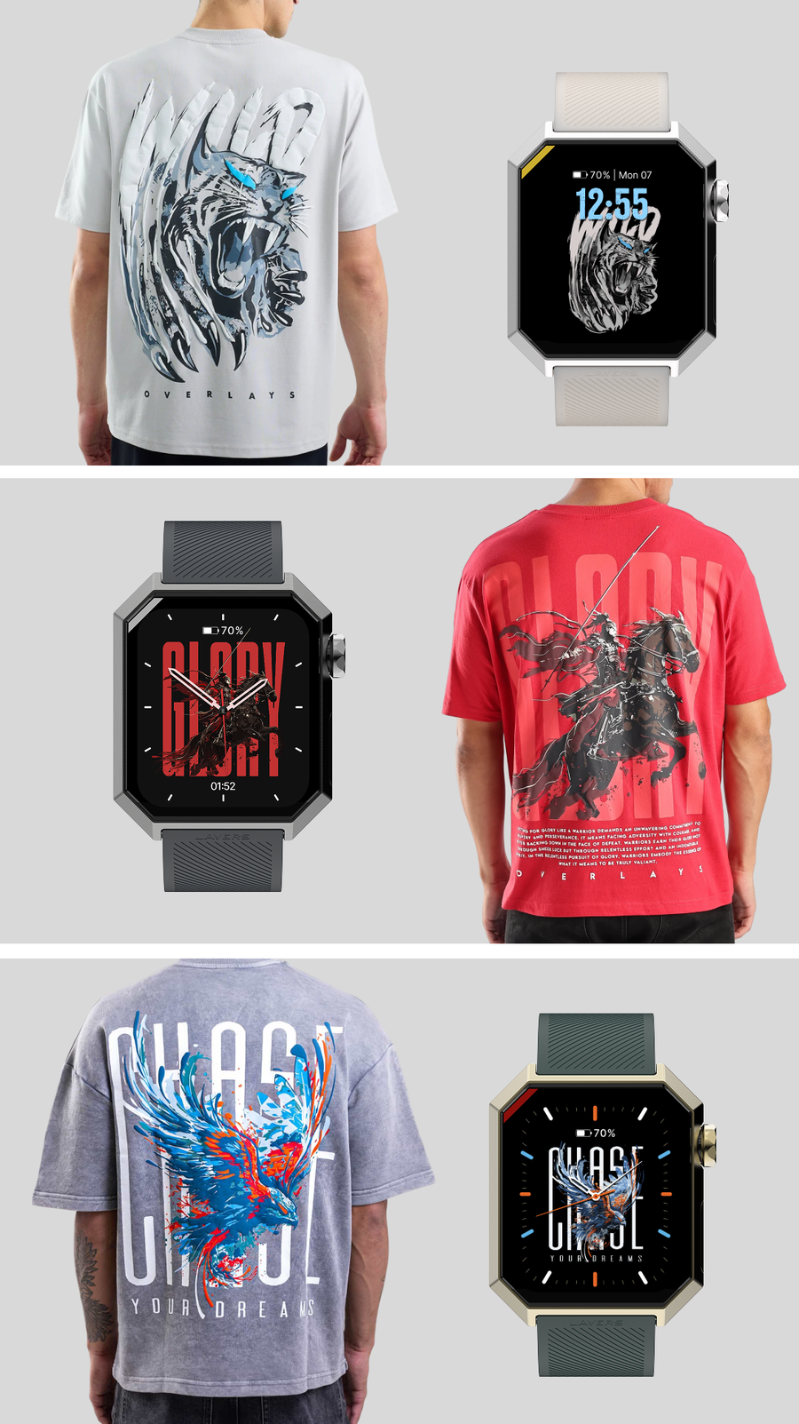
Glory could have been red.
I made it black, because the Anarc’s bezel is black. On a black face the bezel disappears, the screen reads edge to edge, and the watch looks bigger on the wrist than it actually is.
The artwork is an Overlays print — the horse and the rider — so red and black were already doing the work. I drew the marks around the dial, and put a small digital time under the hands: if the marks aren’t enough at a glance, you don’t have to squint.
It was the most-downloaded face of 2025.
Glory and Wild are marketing names, incidentally. The faces don’t carry names inside the watch or the app — there was no clean way to handle them across languages, so they only exist where we sell them.
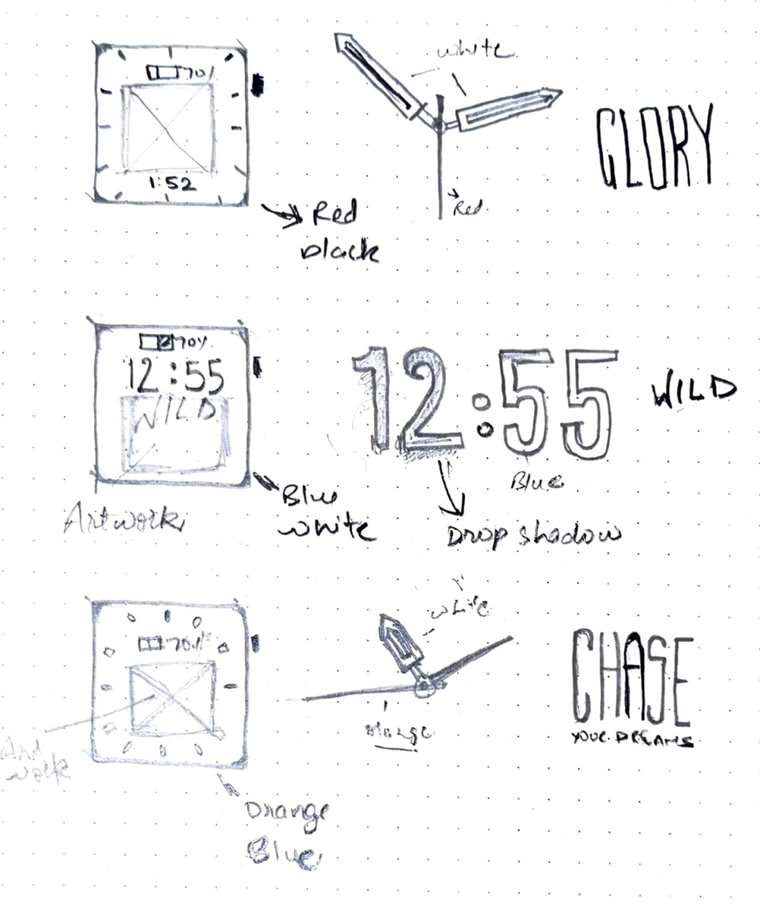
A face that can’t render is a face you drew twice.
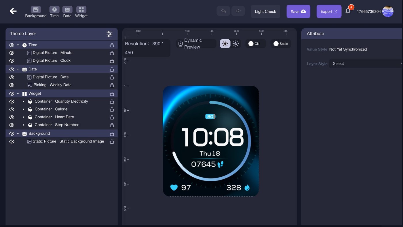
Both generations were designed inside OpenHarmony’s watchface tool, and the tool sets the rules. Text can’t sit at an angle, so nothing runs diagonally. There’s no real layering, so you can’t put the time behind another element the way you would in Figma — to fake it you export every digit from 0 to 9 as its own image and upload them one at a time, per position. Motion is close to nonexistent: a second hand can sweep, and that is the end of it.
I learned all of that on my first trip to the ODM, before designing the bulk of the library. Finding out what the engine could actually render was the point of going.
There is one exception. A handful of faces are built into the watch and coded directly, which is why those can respond to the gyroscope, to touch and to the crown. Most of those were the team’s work — one of the simpler inbuilt ones is mine, and it doesn’t do any of that.
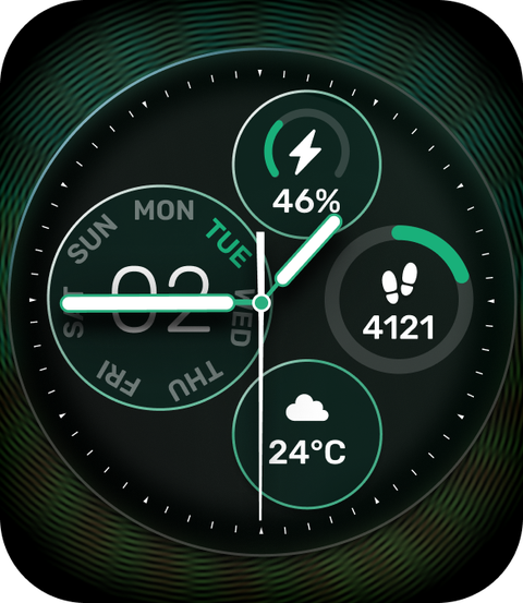
Two faces that could ship, and haven’t.
Earlier versions of these two carried more data than the tool would render. What you’re looking at is the version that can be built — it just hasn’t been chosen for the library yet.
Not everything that hasn’t shipped is dead. These two might still make it.
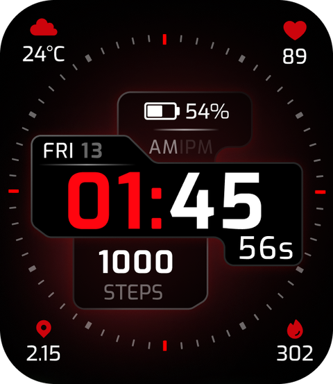
Not every cut face taught me something. Some couldn’t render, some just didn’t fit the set. I’m showing them because a library of 120 isn’t 120 good ideas — it’s a lot of drawing, and some of it doesn’t survive.
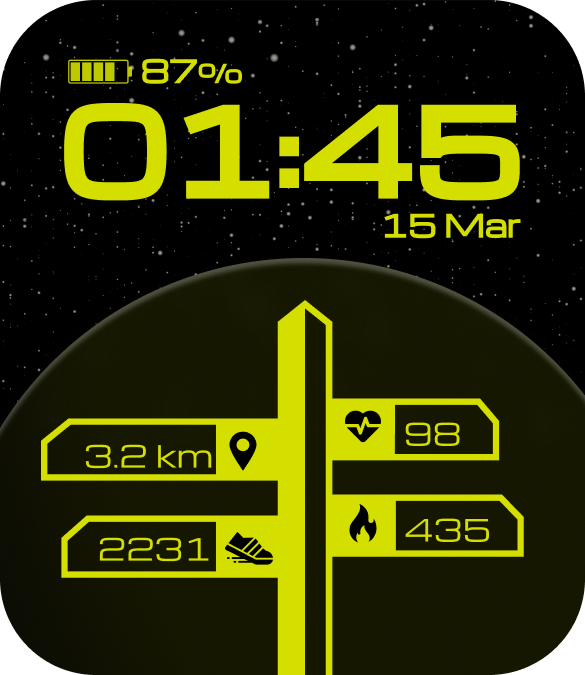
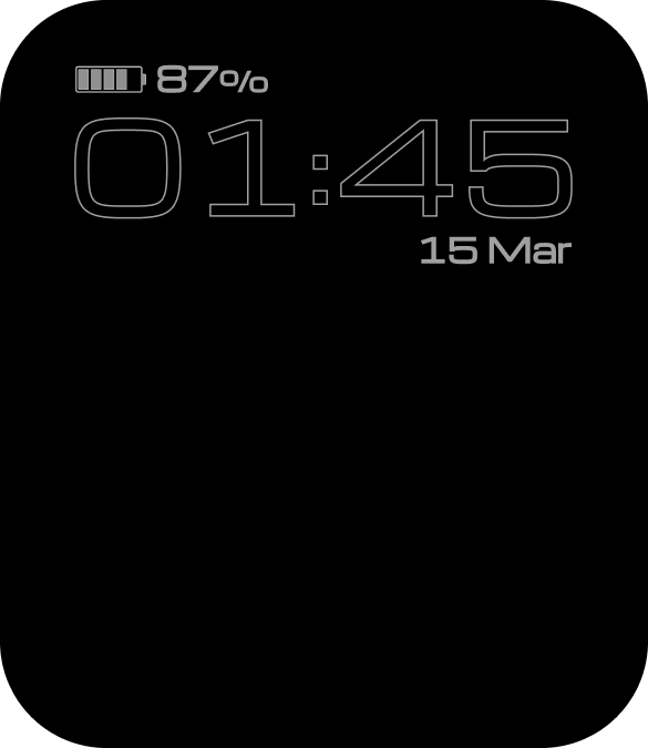
Every face needs a second version of itself.
Anarc 1 had four or five fixed always-on screens shared across the whole library. On Anarc 2 each face gets its own twin — the time, one accent, and most of the lit pixels gone.
That doubled the work, and it changed what a face could be. Anything built on photography or a heavy gradient has no honest twin, so the always-on decision happens while you’re drawing the face, not after it.
Artwork made for fabric, asked to tell the time.
Three faces use prints from Overlays, a clothing label that shares a founder with Layers.
The prints arrived as flat artwork built for cloth — no focal point, no space reserved for anything. The work was stripping the backgrounds out and then building marks, hands and legibility around a pattern that was never drawn with the time sitting on top of it, at 1.85 inches.
The ~120 figure is my own work across Anarc 1 and Anarc 2. The 200+ figure is the shipping library on Anarc 2, which includes faces by others — it’s context, not a claim.
The tool decided almost everything about these faces. The one people downloaded most came down to something the tool had no opinion about — making it black, so the bezel would disappear.