I could change what the app shows you. I couldn’t change how it works.
Redesigning the phone app that pairs with the Anarc 2 smartwatch — built on a partner’s framework, so the flows underneath were fixed and only the surface was mine to change.
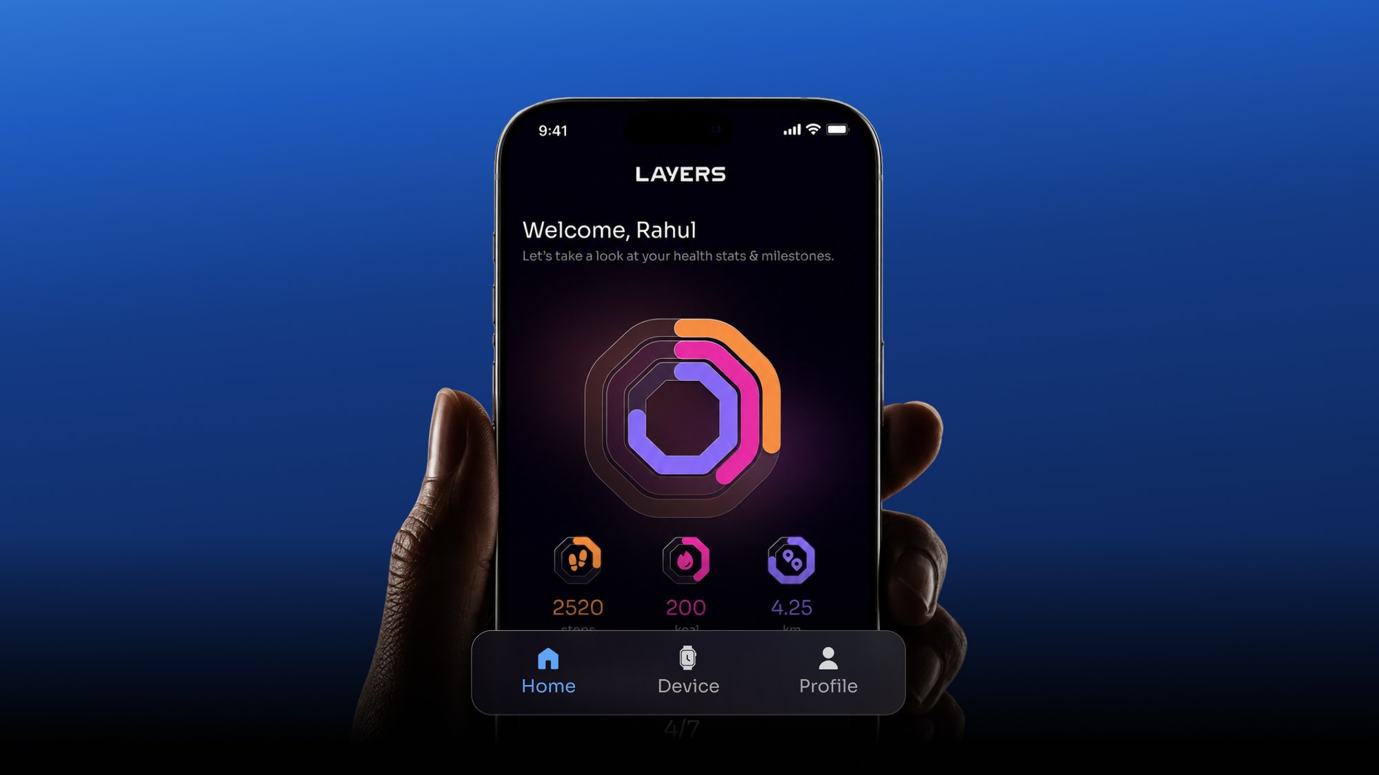
Anarc 2 had a new design language. The app still looked like the old watch.
The existing Layers app worked. It just didn’t belong to anything. It looked like a vendor reference app, because that is what it was built from.
Anarc 2 runs Nexora, an interface we built for the wrist. The job was to make the phone feel like the same product, without rebuilding the app underneath it.
Flows came with the SDK. Only the surface was mine.
The app sits on our SDK partner’s framework. Navigation, flows and plumbing arrive with it.
They could have rebuilt those, at a price nobody was approving weeks before a hardware launch.
Three tabs, fixed.
Home, Device, Profile. No new sections, no re-architecting.
So the work moved to the levers I had: what sits at the top of each screen, how many taps to the thing people came for, and how the whole thing feels in the hand.
Working inside a locked framework isn’t the exception in hardware. It’s most of the job.
One row of this was mine. The redesign is entirely what happens in it.
Most people open this app to change their watchface. Then they close it.
Layers sells a lifestyle product. People buy an Anarc closer to the way they buy a pair of sneakers than the way they buy a medical device, and they change its face the way they change a strap. We ship the health tracking and we take it seriously, but it isn’t the reason most people pick the watch up.
We run a user community and there is a lot of conversation in it. Read enough of it and one pattern repeats: people ask about watchfaces constantly, and about almost nothing else in the app.
Customer support saw the same thing from the other side. Early in my time there they kept fielding the same question — are the new watchfaces live yet? They were. People just weren’t finding them.
That set the priority order. Whatever else the app did, it had to make the watch and its faces the easiest things to reach.
Community conversation and what support kept hearing, not usage analytics. Two sources pointing the same way, which is a strong signal and still not proof.
A working app that told you nothing, turned into one with an order.
The framework handed us an app that functioned. Everything was reachable and nothing was ranked — the watch you own, the faces you came for and the settings you touch twice a year all sat at the same level. I couldn’t change what the app did. I could change what it put first.
- Device
- A list of settings with the watch named in text
- The watch itself on screen, with your faces underneath it
- Home
- A dashboard of everything, in no particular order
- Your day first, because that’s what people open it for
- Library
- 200+ faces in one scroll, 3 categories
- 17 categories, built for browsing rather than scrolling
Three pages, three decisions. The two after them are the states most companion apps never bother to design.
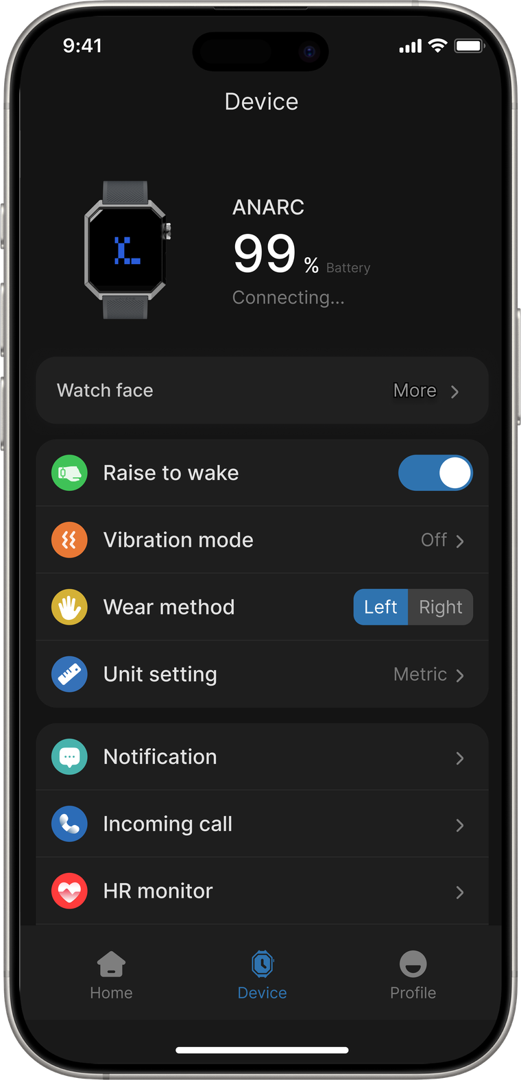
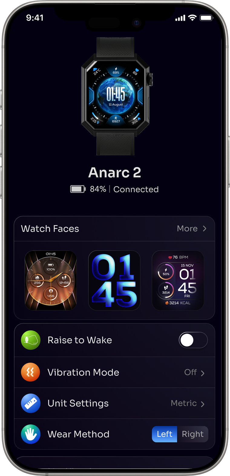
The device screen didn’t show the device.
The old screen opened with a page title and a small generic render — not the watch you actually own. Battery and connection were both on it, ranked against each other, when the honest answer is that you want both at once.
The new screen drops the title and opens on the product itself. Battery and connection sit on one line at the same weight — one glance, both answers.
Watchfaces used to be a single row that said More. Now they sit under the device as faces you can see and tap.
The watch render is a fixed image, not the face currently on your wrist. Live state wasn’t something the SDK would give us.
What happened: I wanted the render to change with the face you actually have on. It couldn’t, so we settled for a fixed one — and I rebuilt the top half of the screen around that limit rather than pretending it wasn’t there.
 1
2
3
1
2
3
- 1 Page title removed. The device is the heading.
- 2 Battery and connection read together on one line. They matter equally, so neither one gets to be the big number.
- 3 The watchface row becomes a shelf you can see into.
Open the app, see your day.
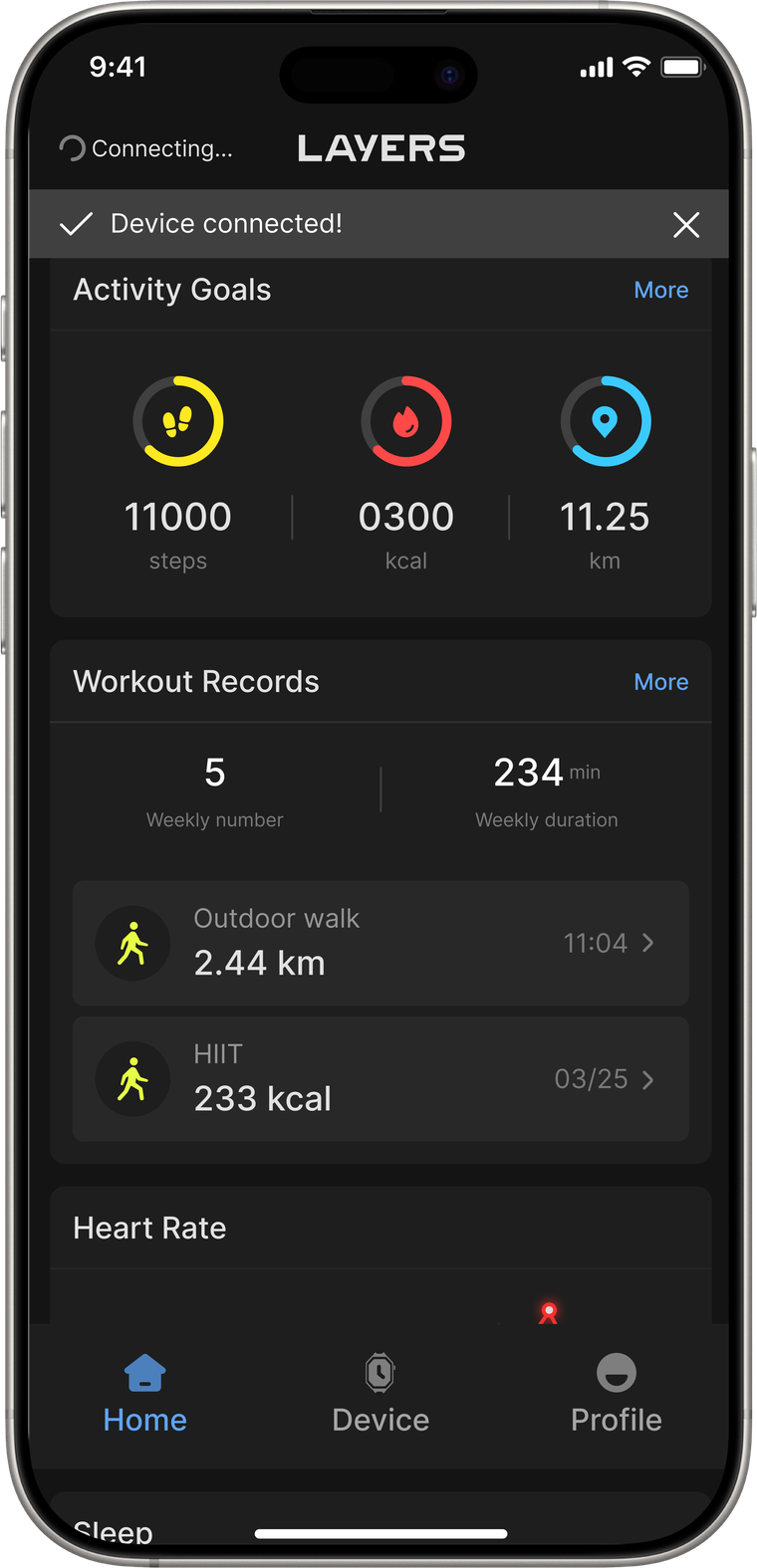
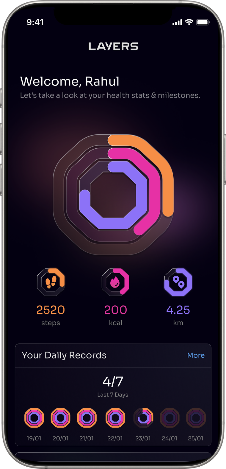
The old home was a stack of cards — activity goals, workout records, heart rate — all at the same weight. Nothing answered the glance.
The new one names you and puts a single question first: how much of your day have you closed. The numbers sit under it, and the cards below can be reordered, so someone who lives in workouts can pull them up.
The rings are octagonal. That shape is the Anarc 2 case. It is the most direct way the app can tell you which watch it belongs to, before you have read a word.
What happened: it shipped as drawn. I asked for the smallest version of the idea — greet the person by name, then the rings — and because it was small, nobody had to argue about it. Not every decision needs a fight; some of them need to be cheap enough to say yes to.
 1
2
3
1
2
3
- 1 One glanceable answer before any card.
- 2 Ring geometry taken from the watch case, not a circle.
- 3 A week at a glance, in the same shape.
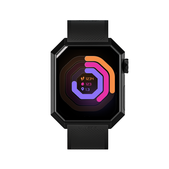
The ring isn’t a circle because the watch isn’t round.
The octagon comes from the Anarc 2 case. It runs on the watch face, on the app’s home screen, and down into the small metric icons and the seven-day strip.
It is the cheapest possible way to make two screens feel like one product. No copy required.
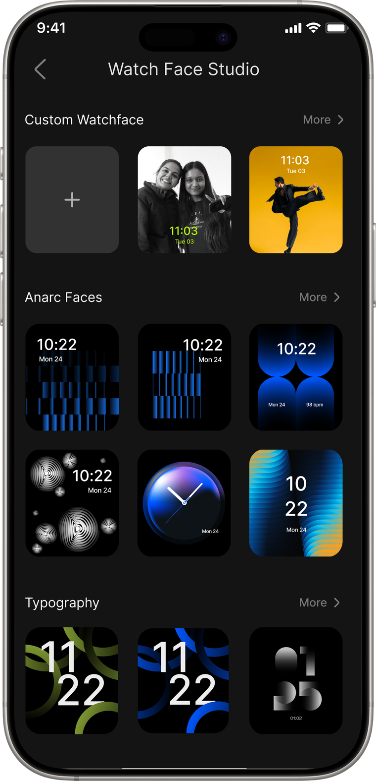
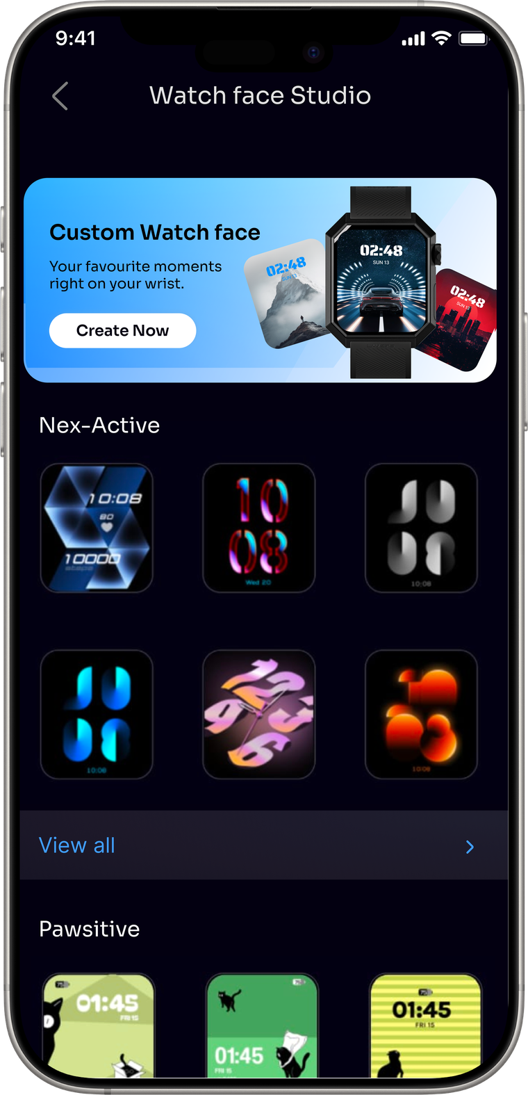
200+ faces need browsing, not scrolling.
Anarc 2 ships with more than 200 watchfaces. I designed around 120 of them across two generations of the watch.
The old library had three sections, and one of them held nearly everything. Finding a face meant scrolling a long undifferentiated list.
We built seventeen categories — Nex-Active, Pawsitive, festive sets and so on. Each shows five to seven faces before the next one starts, so the page keeps moving and you keep finding things you weren’t looking for.
Custom faces moved from a quiet row to a promoted card. It is the one thing in the library that is yours.
What happened: this was a sorting job more than a design one. The 200+ faces already existed, and the category names came from marketing. It made a library browsable that used to be one long scroll — real, but I’d stop short of calling it a transformation.
 1
2
3
1
2
3
- 1 Custom faces promoted to the top of the library.
- 2 Seventeen named categories instead of three.
- 3 Five to seven faces, then the next category begins.
The categories are our taxonomy, not the users’. We named them from watching how our community talks, not from research. A face lives in one category only, so a minimal analog face has to pick a side. That is a call I would want to test.
A companion app spends most of its life reporting on something it can’t control.
The watch goes out of range. Bluetooth drops. A sync stalls. None of that is the app’s fault, and all of it is the app’s problem.
These three are the same home screen. Only the strip at the top changes. Connection is persistent context, not a destination, so it never takes you somewhere else and never hides the numbers you opened the app to read.
Pairing is the one place the app can genuinely fail. The flow itself is the framework’s and I left it alone. What I changed is what the failure screen says: the five things that actually fix it, in order, instead of a message telling you something went wrong.
The firmware update screen is the most cautious thing in the product. An interrupted update can brick a watch on someone’s wrist, so it asks for three specific behaviours and repeats them at 0% and at 100%.
What happened: nobody reported a difference in how the states behaved. What people noticed was the theme — new buttons, new colour, a different app. The failure screens are better than they were, and I have no evidence that anyone was rescued by them.
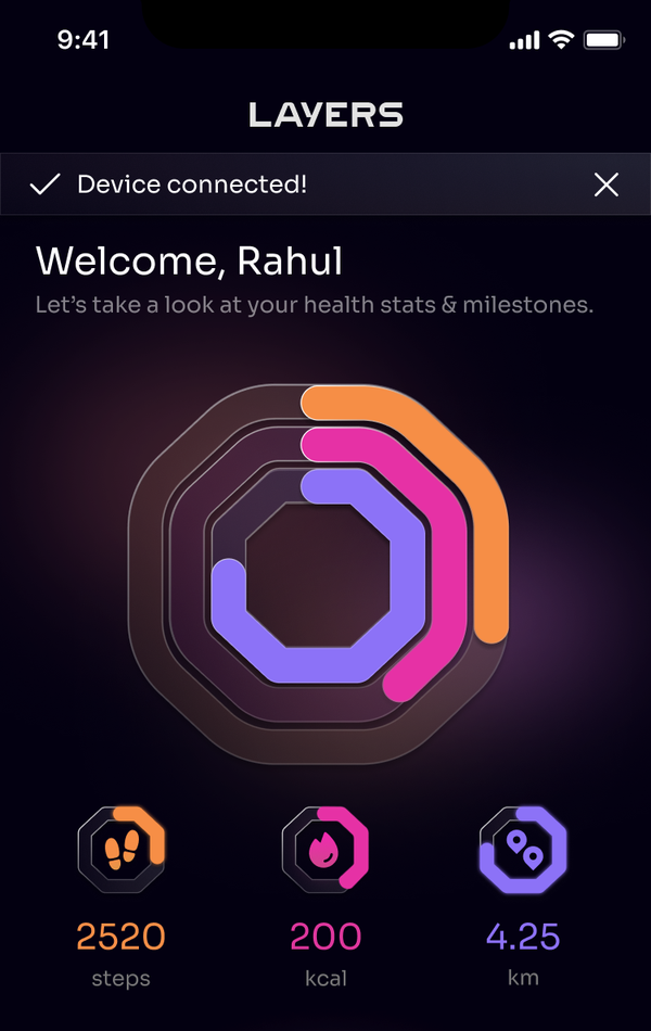
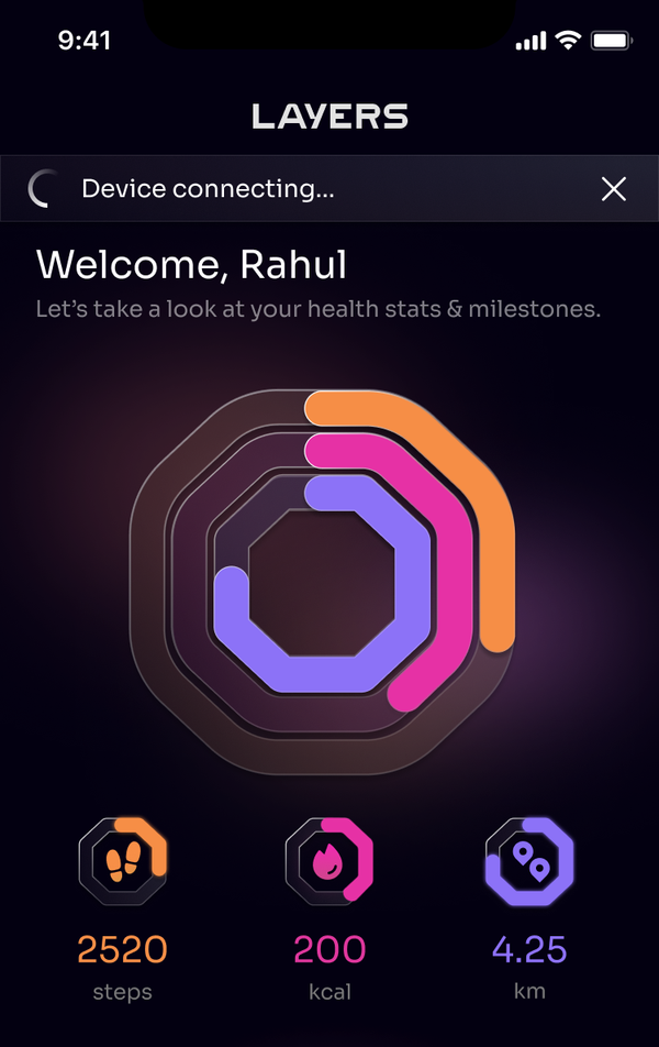
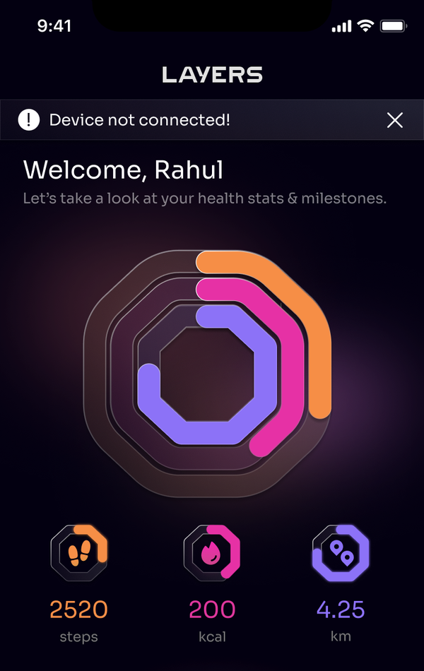
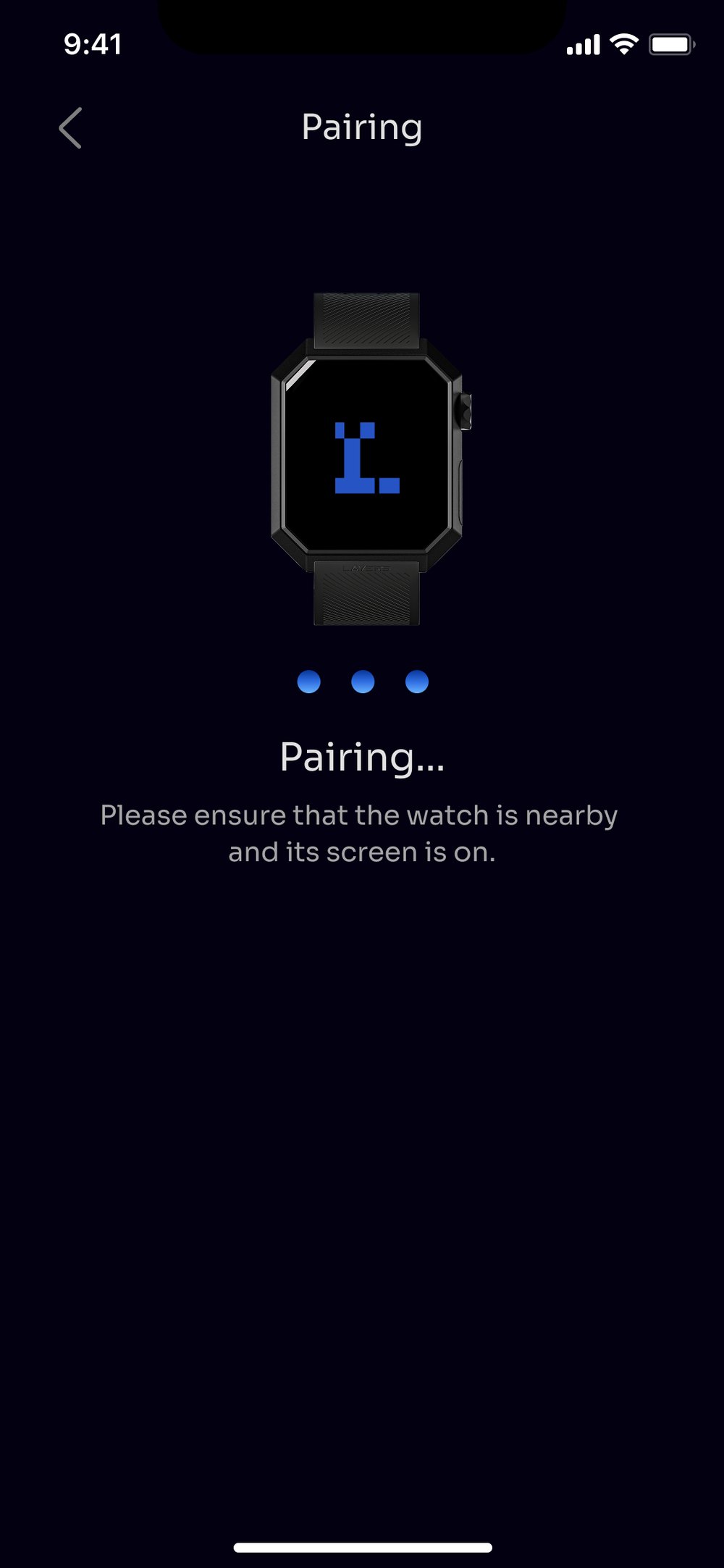
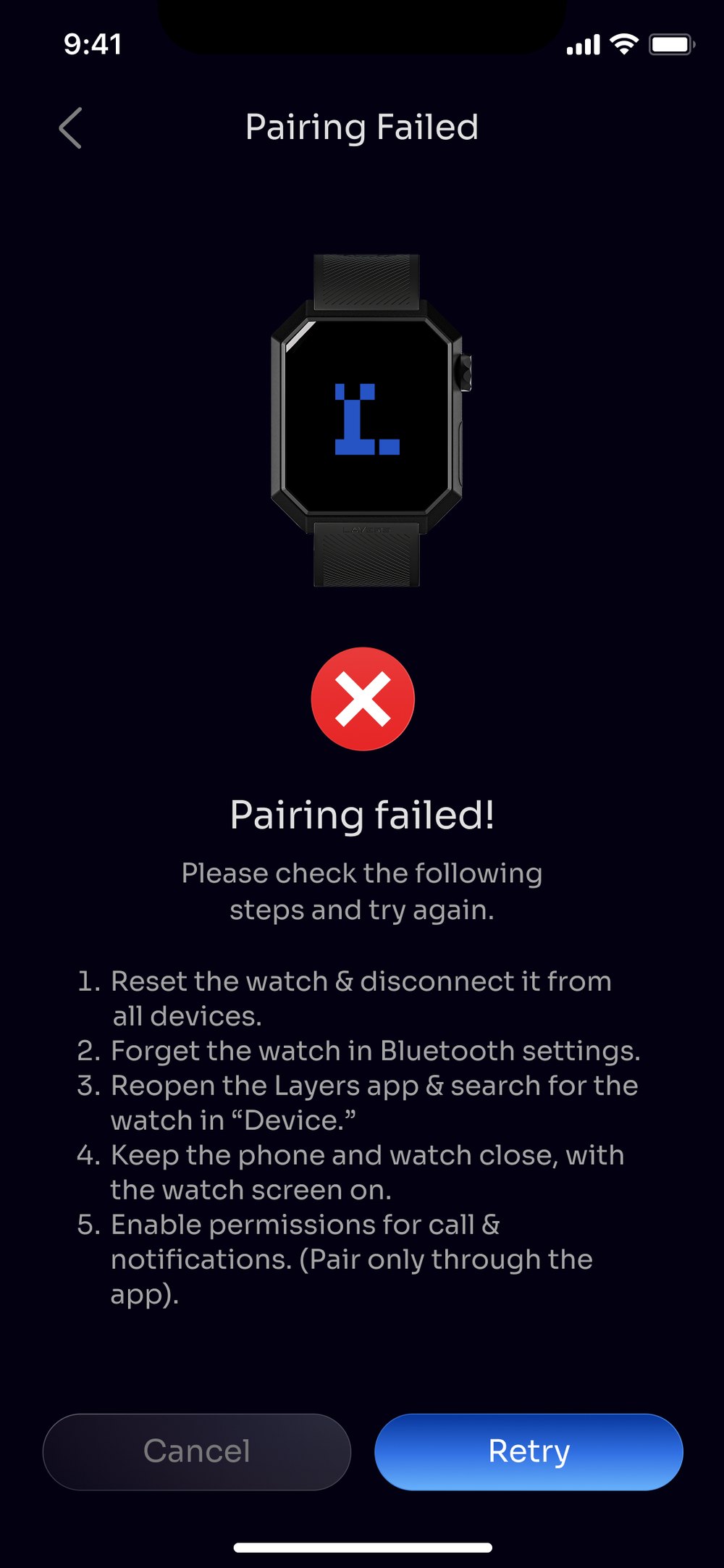
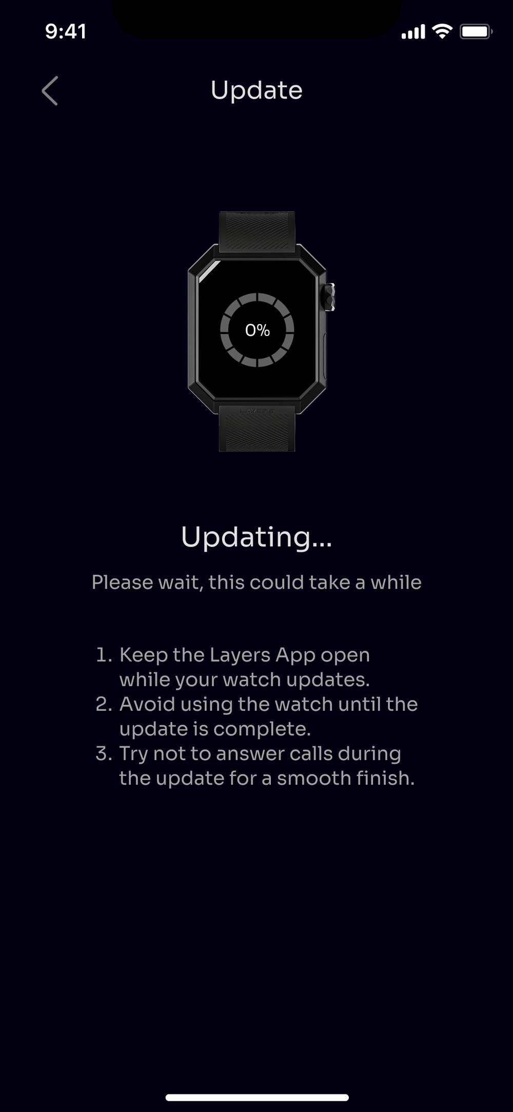
Five recovery steps is a lot to put on a failure screen. It is there because pairing fails often enough to need it, and the pairing flow itself wasn’t something I could reach. Teaching the recovery was the fix available to me, not the fix I wanted.

The day the watch arrives, there is nothing to show.
Every card holds its shape and fills with dashes instead of disappearing. The layout you learn on the first morning is the layout you keep once data arrives.
Weight and Women’s Health invite manual entry, because they are the two things the watch can’t measure for you.
And the rings are drawn empty rather than hidden — the octagon is there on day one, waiting to be closed.
Edit card order sits at the bottom of this screen. It is the same reordering promised on the populated home, and it is available before there is anything to reorder.
What happened: built and shipping. First run got one more change while we were in there: the old app let you sign in with an email address and nothing else. We added a one-time password to your phone. In India that is how people expect to log into anything — email is the fallback, not the default.
The map is light because the map was never mine.
Working on someone else’s framework means designing things that die in review. Not because they were wrong, but because the change gets priced and the answer is no.
The workout map is the clearest example. It is a component that arrives with the framework, in its own light style, and restyling it was never on the table.
There is a third. I pitched showing the watchface you currently have on, live, on the device screen render. It was costed and declined, which is why the render on that screen is a fixed image.
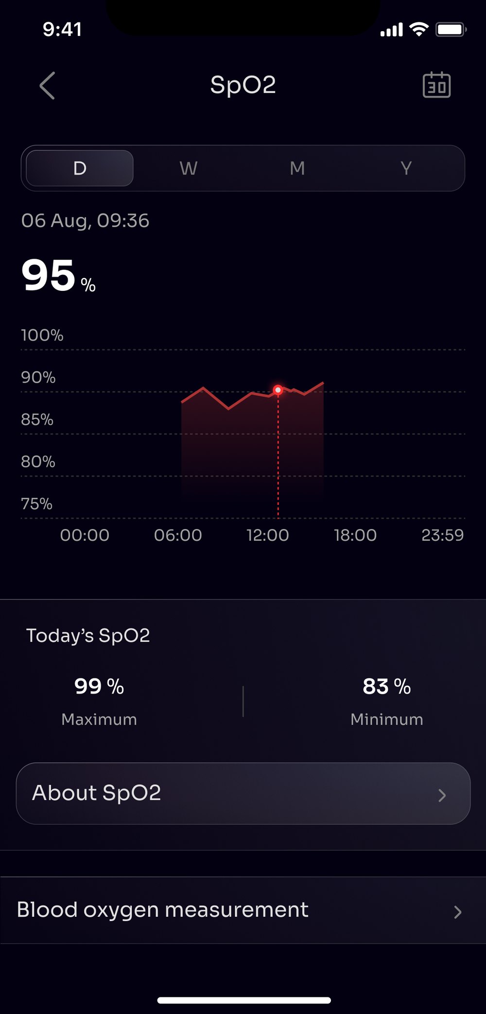
The SpO2 detail view. Designed, reviewed, never developed.
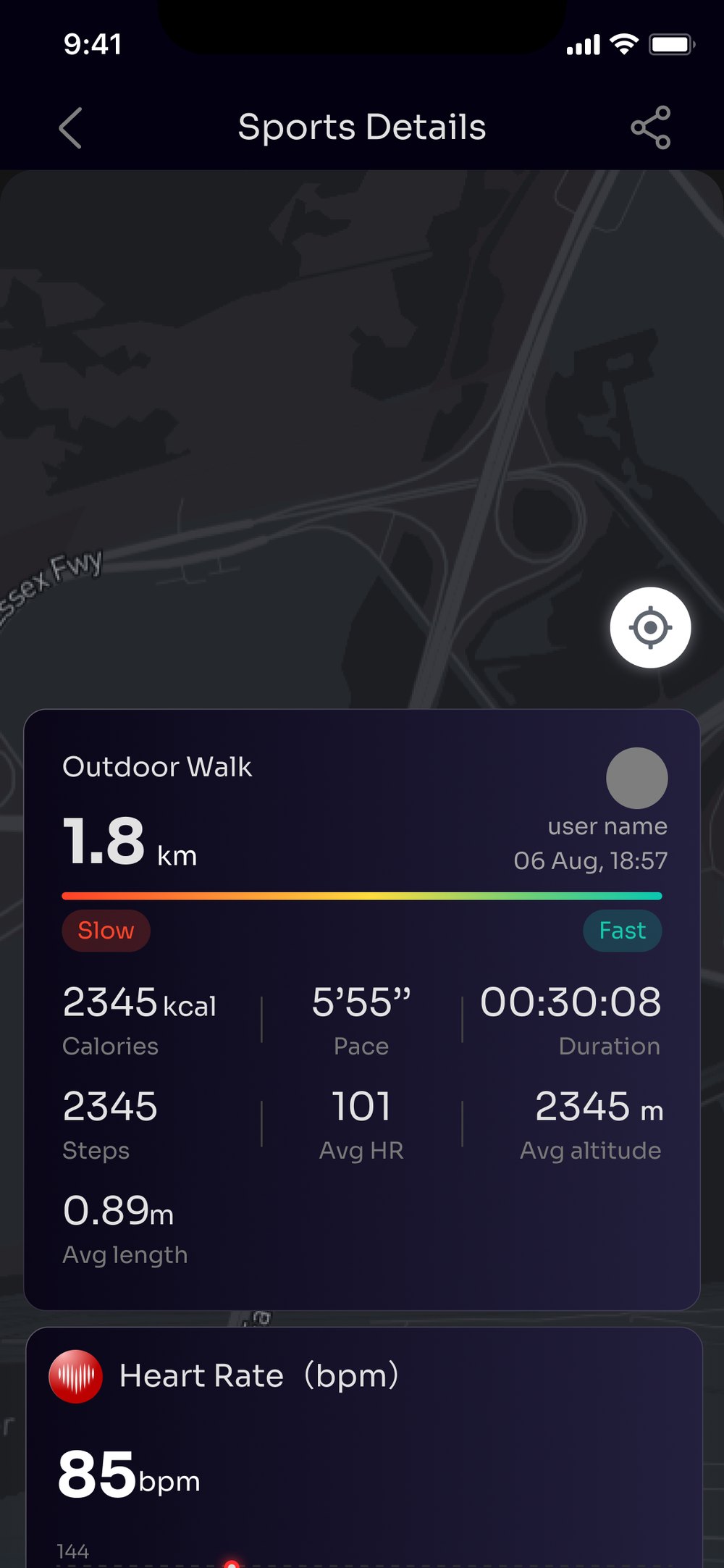
Dark map, my ordering of the metrics.
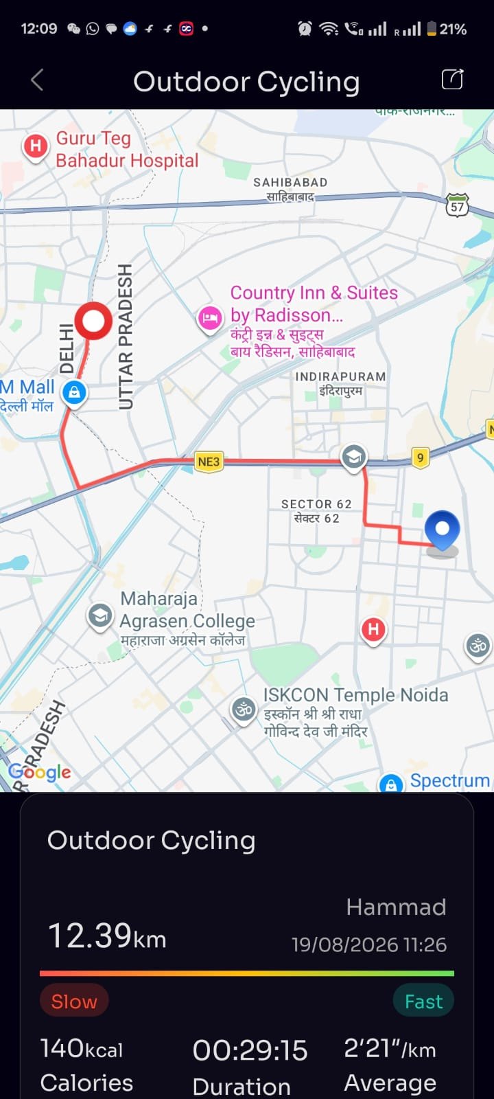
The map is the framework’s own component, in its light style, inside an otherwise dark app.
Apple and Google don’t let the watch do the same things.
Music can’t be loaded onto the watch from iOS. Quick replies can’t be set from iOS. Android needs its own permissions section in the account page, and iOS has no equivalent to put there.
We hid the unavailable features on iOS rather than showing them greyed out. An app full of disabled rows tells you what you can’t have every time you open it. The differences are documented on our website instead.
That is a trade-off, not a clean win. An iPhone owner who reads a review mentioning music has no way to find out from inside the app why they can’t see it. Given the choice again I would want one line in Settings rather than silence.
One design language. Two devices. Two different sets of rules.
A design system doesn’t always break on the interesting parts. Sometimes it breaks on a licence.
- Carried
- Dark base, colour system, button colours and states, card treatment, octagon geometry.
- Broke
- The typeface. Nexa is the watch font. Licensing it for a mobile app was a separate and expensive licence, so the app ships in Sora — the closest match we could justify.
I didn’t touch pairing, sync, or firmware updates.
They were familiar to existing users, and they are the flows where failure isn’t recoverable. An interrupted firmware update can brick a watch on someone’s wrist.
Restyled to match, and the failure copy rewritten. The flows underneath are untouched.
Watchfaces you earn, not just pick.
Right now the library is a catalogue. You scroll it, you pick one, you leave.
The idea I keep coming back to is that some faces should be earned. Close your goals for a full week and one unlocks, stamped with the date you did it. Two Anarc owners can race for the same one, and whoever finishes first keeps it.
The trade-off matters more than the mechanic. Watchfaces are the main reason people open this app, so a lock on the library would break the one habit it has. Earned faces sit on top of an open library, never in front of it.
I didn’t push this as a build. The flows were closed and the hardware date was fixed, so it wasn’t the moment. It sits in our internal ideas page with the others, and I would want real research behind it before anyone started.
Most of this job was knowing who to ask.
On someone else’s framework, the useful question is rarely “what should this look like” — it’s “what will they let us change, and what does that cost.”
- SDK partner
- Owned the navigation, flows and plumbing. Every structural change came back with a price attached.
- iOS & Android developers
- Worked with them in person at our partner’s office in China. Two platforms, two sets of rules.
- Customer support
- Told me what people actually wrote in about. The watchface problem came from them, not from analytics.
- Design manager & product head
- Reviewed the work and decided what was worth paying to rebuild.
The app shipped with Anarc 2 on 21 September 2026. Post-launch data isn’t in yet. No ratings, no retention, no usage. Everything above is scope, constraint and reasoning rather than outcomes.
It was tested internally, with the team, and not with users outside the company. With the flows locked there was little that external testing could have changed, but that is a limit on this work and not a decision I would defend on a project where the flows were open.
The previous generation’s app sits at roughly 3.5 on the Play Store. I didn’t work on it, and I am not claiming its replacement as an improvement until there are numbers to show.
We landed between the old app and the one we wanted. I didn’t expect that, and I don’t think it was a failure — it’s what shipping looks like when you don’t own the whole stack.